ETC5523: Communicating with Data
Writing Clearly and Concisely
Lecturer: Michael Lydeamore
Department of Econometrics and Business Statistics
Aim
- Structure a data-driven document for readability and impact
- Write executive summaries that are concise, insight-rich and actionable
- Apply clarity and concision principles to bdoy text, figures and captions
- Edit for audience understanding
Framing
Good analysis buried in bad writing has no impact
Readers will skin your report: your structure and clarity will decide whether they understand your point.
Example
You’re reporting on website traffic for Q1.
Version 1
The analysis of the web traffic data for the first quarter indicates a generally positive trend overall. While there were fluctuations in certain weeks, the average number of visits showed an upward trajectory. This could be the result of a variety of factors, including changes in marketing activity and seasonal influences. Of particular note is that in March, the weekly visits reached their highest level so far this year, which may have been partly due to the launch of the new referral program.
Version 2
Website traffic grew 28% from January to March, peaking in the week of March 15 after the referral program launch. Growth was consistent despite minor weekly dips, suggesting sustained campaign impact.
Tip
Which one would you rather send to the CEO?
Framing
- Front-load your key metrics
- Anchor in time and context / cause
- Remove filler
- Try and read in under 10 seconds
Example
Version A
Over the past year, our customer retention efforts have involved a variety of strategies aimed at improving satisfaction and engagement. We introduced a loyalty program in June, expanded our support hours in August, and ran targeted reactivation campaigns throughout Q4. While these initiatives were generally well-received, churn rates fluctuated. In Q3, churn reached a low point, but by Q4 it had risen again to, possibly due to competitive pressures and seasonal effects. Overall, the year closed with a churn rate slightly better than the year before (18% vs 22%), but with notable differences between segments.
Version B
Annual churn dropped from 22% to 18%, with the biggest improvement in Q3 after launching the loyalty program. Q4 saw churn rise again, mainly in price-sensitive segments facing increased competition.
Example
Version B
Annual churn dropped from 22% to 18%, with the biggest improvement in Q3 after launching the loyalty program. Q4 saw churn rise again, mainly in price-sensitive segments facing increased competition.
- Leads with outcome and number, then cause
- Trims 60% of the words
- Doesn’t spend time on background
Document structure
A well structured document has:
- An executive summary
- An introduction
- Methods / data sources
- Results / Findings
- Discussion / Interpretation
- Conclusions / Recommendations
Document structure
When reading, you want to:
- Understand the big picture from the summary
- Trust the data because of the methods
- See the evidence in the results
- Know what to do next from the recommendations
Introduction
- Why the analysis exists
- Background, problem statement, audience relevance
- Scope - what’s included and excluded
Methods / Data
- Where the data comes from
- Definitions, filters, assumptions
- Just enough detail for credibility and reproducibility
Results
- Keep an order (chronological, thematic, etc.)
- Group related findings together
- Use figures and tables to highlight key points
Discussion
- Explain why results matter
- Compare to benchmarks or historical trends
- Address limitatiosn and confidence
Conclusion
- Direct implications
- Next steps and actions
Example
In Q2, average customer wait time dropped from 12 minutes to 7 minutes following the implementation of the new scheduling algorithm.
Next quarter, expanding the system to all regional centres is expected to reduce wait times by an additional 20%.
To improve customer satisfaction and retention, we implemented a new AI-driven scheduling tool in early April.
Data was collected from service logs across 15 branches between January and June 2024.
This report evaluates the impact of the scheduling tool on wait times and overall service efficiency.
The primary driver of the improvement was the reduction of scheduling conflicts during peak hours.
Example
Context
This report evaluates the impact of the scheduling tool on wait times and overall service efficiency.
Background
To improve customer satisfaction and retention, we implemented a new AI-driven scheduling tool in early April.
Methods
Data was collected from service logs across 15 branches between January and June 2024.
Results
In Q2, average customer wait time dropped from 12 minutes to 7 minutes following the implementation of the new scheduling algorithm.
Discussion
The primary driver of the improvement was the reduction of scheduling conflicts during peak hours.
Next Steps
Next quarter, expanding the system to all regional centres is expected to reduce wait times by an additional 20%.
Signposting
Signposting helps readers navigate your document:
- Use headings to indicate sections
- Use subheadings if they will help
Make sure sections are linked:
- Paragraphs start with a topic sentence
- End with a linking sentence taking the reader to the next section
Tip
I should be able to read the first sentence of each paragraph and understand the document.
Clarity and concision
- Avoid ambiguity - be confident in your statements
- Remove redudancy, cut filler. Be ruthless
- Balance detail and readability
Old-to-new technique
You have to guide readers through your ideas. But they may not share your background knowledge on the topic.
Take the reader from familiar concepts first into new ideas.
This doesn’t mean guess what your reader knows.
Consider anything you’ve already mentioned to be old, and all concepts for the first time to be new.
Once a new idea has been provided, it is then an old idea you can use in future sentences and paragraphs.
Old-to-new example
This example does not go from old to new.
Giant breed dogs tend to experience greater joint pain as they age compared to their smaller canine relatives. The weight of larger dogs often causes stress on their hips. Discussing dietary options with a veterinarian is a good way to keep a dog’s weight reasonable and exercising your dog every day is important
Old-to-new example
Giant breed dogs tend to experience greater joint pain as they age compared to their smaller canine relatives. This joint pain often affects the hips in larger dogs, and it can be caused by their weight. But there a ways to keep a dog’s weight reasonable, from discussing dietary options with a veterinarian to exercising your dog every day.
- Joint pain is introduced in the first sentence, then used as a bridge
- Dog’s weight becomes old, so two new ideas are introduced
Paragraph to paragraph
The same old-to-new technique can be used to link paragraphs:
Discussing a giant breed dog’s diet with a veterinarian is vital, because they have expertise in the nutrition that will keep these breeds healthy. (Followed by evidence, interpretation, analysis)
This discussion is a significant step in the right direction, but large dogs also require daily exercuse to maintain optimal physical health. (Followed by evidence, interpretation, analysis)
Even if an owner finds the right food and exercise for their particular dog, they must consider nutirional supplements to help with the wear-and-tear on joints. (Followed by evidence, interpretation, analysis)
Paragraph to paragraph
A good reader may be able to follow the logic of paragraphs without guidance, but we can take control of the narrative to make sure they follow it.
Tying ideas together
Use internal summaries to remind readers of points you’ve made:
Four possible solutions to the problem have been outlined, but it is important to consider flaws to these ideas.Use pronouns and pointing words to refer to nouns mentioned previously:
The suggestion was creative. It saved the company several thousand dollars.
Buying a house can lead to a lot of unchecked stress. This stress can affect a buyer’s ability to remain realistic of financial limitations.Repeat key words or phrases:
Several employees participated in the health fair. Of the events the company sponsors, the health fair is the most important.Insert transitional words such as therefore, similarly to connect ideas to one another:
Four-day work weeks produce loyalty and satisfaction in employees. Similarly, increases in paid time off show substantial morale boosts.
Parallelism
Phrase similar ideas in a similar way.
Repeat articles and verb tenses with each item in a series.
Incorrect: Speaking in public is sometimes harder than to speak on the phone
Correct: Speaking in public is sometimes harder than speaking on the phone
Parallelism Exercise
Phrase similar ideas in a similar way.
Repeat articles and verb tenses with each item in a series.
Incorrect: Donna was asked to write, answering phones, and attended meetings.
Correct: Donna was asked to write, answer phones, and attend meetings.
Writing clearly
In English, works generally have two types of meanings:
- Denotative meaning - the literal meaning of a word
- Connotative meaning - the associations and emotions that a word evokes
For example, slender, thin, and skinny have the same denotative meaning, but very different connotations.
Writing clearly
Always follow this, that, these, and those with a noun:
Unclear: I will take this
Clear: I will take this report.
Writing concisely
- Elimintate unnecessary phrases
- Use clear and straightforward language
- Write in active voice
- Shorten wordy phrases
- Avoid starting sentences with “there is” or “it is”
- Eliminate extra nouns
- Eliminate filler words
Writing concisely - Exercise
It is important to note that there are a variety of different reasons the campaign did not perform in the way we ideally wanted, which is something we should take into consideration. In order to move forward, an evaluation will need to be conducted by the team with respect to the targeting criteria, due to the fact that performance was lower among younger audiences. The dashboard, which is presently in the process of being updated, was used for most of the analysis. Basically, click-through rate was kind of flat in Q2, and increases in landing-page load time had a negative impact. A decision will be made by leadership after the results are reviewed.
Writing concisely - Solution
The campaign underperformed mainly because we targeted younger audiences poorly and the landing-page load time increased. The team will review targeting criteria and update the dashboard before the next launch. Click-through rate was flat in Q2. Leadership will decide next steps after we present the results.
Notice how this leads with the cause, uses active voice, trims fillers and cuts noun stacks.
Executive Summaries
A stand-alone tl;dr for time-poor readers. That’s all of them.
Must include the so what, be skimmable, limited in numbers, actionable.
This might be all the reading you get: make it count.
BLUF Structure
Bottom Line Up Front is a popular structure:
- Bottom line: outcome in one sentence, one key number.
- Drivers: 1-2 causes, selective numbers
- Implications: risk/uncertainty, impact
- Action: what to do next, and by when
Please practice number hygiene!
Round sensibly, include denominators, but probably no more than three numbers total.
How to write one
[Outcome] increased/decreased by X to Y [period/audience]. The change was driven by A and B. This matters because impact/constraint. We recommend action by owner/timeframe.
or
- Outcome X -> Y (Δ)
- Drivers A, B
- Do C by D, monitor E
- Risk and limit F
Exercise
In Q2, the growth team pursued several initiatives related to the purchase funnel and promotional activity that, taken together, affected performance in a number of ways. We simplified the checkout flow in May, which coincided with changes in mobile latency across devices; desktop improved, while Android experienced a short-lived slowdown in mid-June due to CDN routing. We also ran a referral promotion from June 10–30 with a 10% incentive. As a result of channel mix and CPMs, CAC edged up by 6% quarter-on-quarter. At the same time, our regional revenue mix shifted toward APAC by 36% as campaigns gained traction there. Overall conversion moved upward by 4.1% over the quarter, though results varied by segment and week. A detailed breakdown is available in the appendix; note that attribution overlaps between the promo window and the flow changes, so causality should be interpreted cautiously and additional testing is recommended before generalizing.
- CAC = Customer Acquisition Cost
- APAC = Asia-Pacific Region
- CDN = Content Delivery Network
- CPM = Cost per 1000 impressions
Exercise - Solution
- Q2 conversion improved to 4.1%, due to a simplified checkout; a brief Android latency spike in June muted some gains.
- Mid-June referral promotion boosted top-of-funnel but raised CAC (+6% QoQ) as paid-social CPMs increased. Revenue tilted toward APAC (36%), which lowers acquisition costs but increases localization needs for onboarding and support.
- Recommended to keep the streamlined checkout; fix Android latency via CDN routing; tighten referral targeting to protect CAC; and prioritize APAC onboarding with localized payment copy and QA before the next campaign.
Common pitfalls:
- Weather report summaries: Make sure to say “so what”
- Jargon and metrics without context
- Laundry list of numbers
- Burying the ask
Audience Pivot: CEO vs. Engineering Lead
Version A — CEO (decision-oriented): - Lead with outcome & business impact. - Clear ask (owner + timeframe).
Version B — Eng Lead (implementation): - Lead with drivers/constraints. - Concrete actions; avoid budget asks unless essential.
Deliverable: Two summaries (A & B) that differ in emphasis, not facts.
Audience Pivot
- Checkout simplification raised conversion (now 4.1%). A mid-June Android latency spike (CDN routing) reduced Android lift during the promo window. APAC at 36% of revenue increases localization demand.
- Re-route Android traffic on CDN and add latency alerts; A/B the referral audience to cut low-quality signups that drive +6% CAC; ship localized onboarding and payments copy for APAC. Owners: Core Web, Growth, Product. Target: next sprint for CDN; two sprints for copy.
What differences do you notice?
Figures, Tables & Captions
We’ll talk later in the semester about how to make figures and tables.
Today’s focus is on writing about these elements.
Caption structure
What is a good caption?
- Who/what/when, unit/denominator, and critical caveats
- State the takeaway
- <= 3 numbers, avoiding method details unless essential
Checklist: Scope · Takeaway · Units/denominators · Selective Numbers · Caveats
Caption templates - takeaway
- Line chart:
[Outcome] moved from X to Y from T1-T2, with the sharpest change in Month/Group after Event (n=**, unit). - Bar chart:
Group A leads Group B by X, driven by Reason/segment (period) - Scatter plot:
Metric B increase ~m per 10 units of A, strongest for Segment (period). - Table:
Top three categories account for 78% of total metric, with Category A at X% (period).
Caption examples

Line chart of monthly signups in 2025
Caption examples
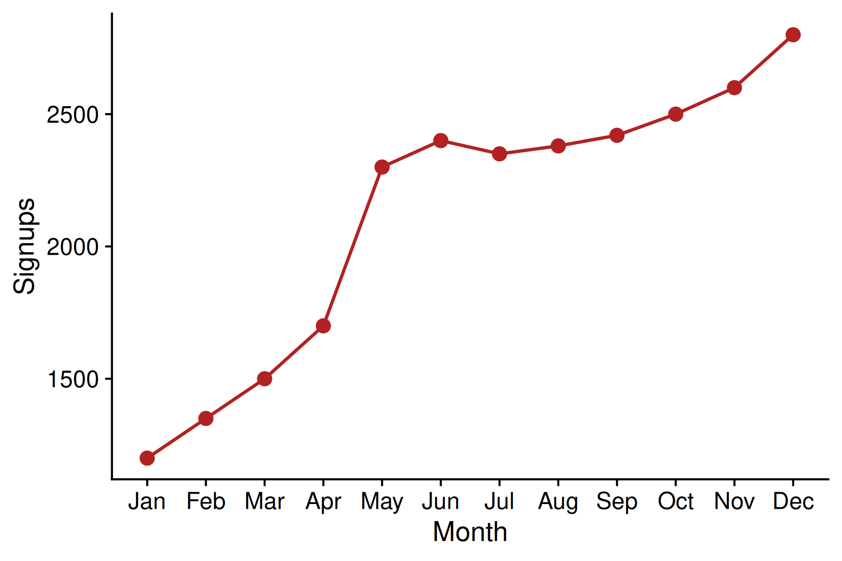
Monthly signups doubled between January and June 2025 (1.2k -> 2.4k), with a May spike after the referral launch; growth held steady in June.
Caption examples
| Cohort | Cohort size (n) | Month 12 churn | Month 12 retention |
|---|---|---|---|
| 2019 | 5,200 | 13.0% | 87.0% |
| 2020 | 6,100 | 14.0% | 86.0% |
| 2021 | 5,800 | 12.0% | 88.0% |
| 2022 | 6,400 | 16.0% | 84.0% |
| 2023 | 7,000 | 19.0% | 81.0% |
Table of churn by cohort
Caption examples
| Cohort | Cohort size (n) | Month 12 churn | Month 12 retention |
|---|---|---|---|
| 2019 | 5,200 | 13.0% | 87.0% |
| 2020 | 6,100 | 14.0% | 86.0% |
| 2021 | 5,800 | 12.0% | 88.0% |
| 2022 | 6,400 | 16.0% | 84.0% |
| 2023 | 7,000 | 19.0% | 81.0% |
Churn by cohort from 2019 to 2023. 2019-2021 cohorts have low churn (<14%); 2023 had the highest at 19% due to mobile onboarding drop-offs.
Writing about figures and tables in text
- Lead with the point and then cite the visual:
Conversion rose after checkotu simplifcation; Fig. 2 shows the May jump. - Add what the eye can’t: scale, denominators, uncertainty
- Don’t narratve the drawing
- Don’t duplicate the caption
Pattern: Claim · Specific constrast/number · Visual reference · Implication
Writing about figures and tables in text - Example
Pattern: Claim · Specific constrast/number · Visual reference · Implication
After we removed one form field, conversion increased to 4.1% (+0.6 pp). Figure 2 shows the step-change in May, with a smaller lift on Android during the latency incident. This supports continuing the simplified flow while we address mobile performance.
Exercise
Scenario:
Monthly active users rose +22% Q2; Fig. 3 shows steady gains after email reactivation; Table 1 lists top segments (dormant 30–60 days = biggest lift).
Task:
Write 2–3 sentences that (1) make the claim, (2) use ≤2 numbers, (3) reference Fig. 3/Table 1, (4) state an implication.
Exercise - Solution
Monthly active users grew 22% in Q2, driven by the email reactivation program. Figure 3 shows the step-up in June, and Table 1 confirms the largest lift came from 30–60 day dormant users. We should expand the sequence to 90-day dormants and A/B the subject lines.
Caption pitfalls
- Caption describes the pixels vs Captions stating the point
- Too many numbers
- Missing denominators and units
- Caption and body text disagree on the key message
- In-text mentions without an implication
Wrap-up
5 rules for clear, concise, structured writing:
- Lead with the main insight
- Keep the flow logical and signposted
- Summarise effectively for time-poor readers
- Make visuals tell a story through captions
- Edit ruthlessly for clarity and concision
Wrap-up

ETC5523 Week 4