ETC5523: Communicating with Data

Effective data visualisation

Lecturer: Michael Lydeamore

Department of Econometrics and Business Statistics


Aim

  • Apply data-visualisation principles to communicate a message clearly and efficiently
  • Use data visualisation to create effective data stories

Why

  • “A picture is worth a thousand words.”
  • Data visualisation can make large, complex data more accessible, understandable and usable.

Data visualisation

Data visualization is part art and part science. The challenge is to get the art right without getting the science wrong and vice versa.

– Claus O. Wilke, Fundamentals of Data Visualization

Role

  • A data visualisation must communicate the data accurately to its intended audience.
  • A data visualisation must not mislead or distort the information in the data.

💬️ Communicating with data visualisation

Communication

Effective data visualisation uses the human visual system to help an audience understand a particular message in the data.

  • In this lecture, the terms data visualisation, plot, graphic, statistical graphic and figure are used interchangeably.

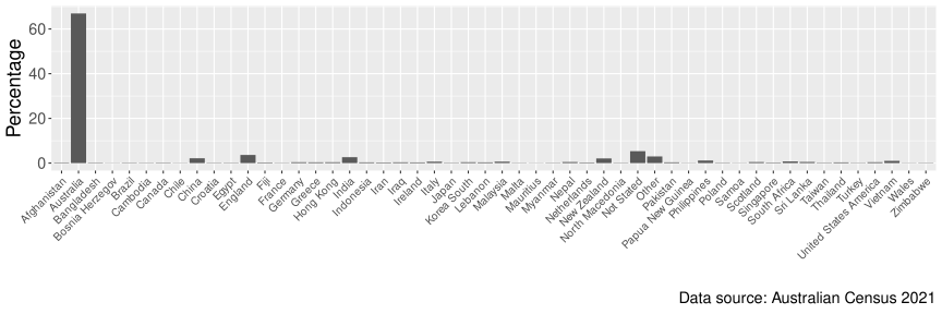
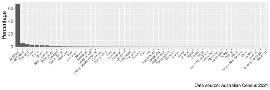
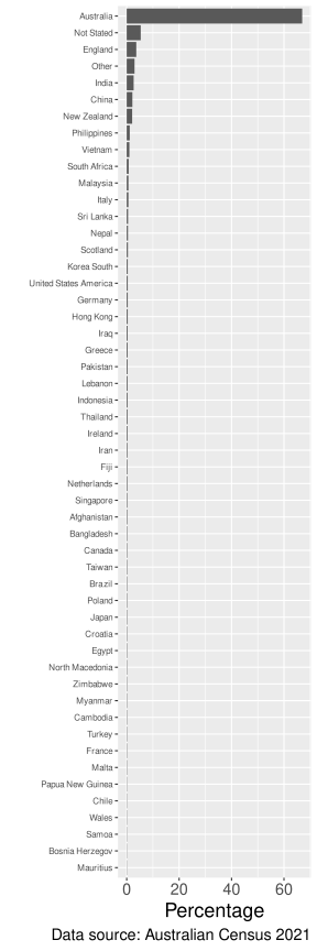
Place of birth in the 2021 Australian Census

Place of birth Count %
Australia 17,020,422 66.9
Not Stated 1,358,658 5.3
England 927,490 3.6
Other 759,173 3.0
India 673,352 2.6
China 549,618 2.2
New Zealand 530,492 2.1
Philippines 293,892 1.2
Vietnam 257,997 1.0
South Africa 189,207 0.7
Malaysia 165,616 0.7
Italy 163,326 0.6
Sri Lanka 131,904 0.5
Nepal 122,506 0.5
Scotland 118,496 0.5
Korea South 102,092 0.4
United States America 101,309 0.4
Germany 101,255 0.4
Hong Kong 100,148 0.4
Iraq 92,922 0.4
Greece 92,314 0.4
Pakistan 89,633 0.4
Lebanon 87,340 0.3
Indonesia 87,075 0.3
Thailand 83,779 0.3
Ireland 80,927 0.3
Iran 70,899 0.3
Fiji 68,947 0.3
Netherlands 66,481 0.3
Singapore 61,056 0.2
Afghanistan 59,797 0.2
Bangladesh 51,491 0.2
Canada 50,223 0.2
Taiwan 49,511 0.2
Brazil 46,720 0.2
Poland 45,884 0.2
Japan 45,267 0.2
Croatia 43,302 0.2
Egypt 43,213 0.2
North Macedonia 41,786 0.2
Zimbabwe 39,714 0.2
Myanmar 39,171 0.2
Cambodia 39,043 0.2
Turkey 38,568 0.2
France 36,019 0.1
Malta 35,413 0.1
Papua New Guinea 29,984 0.1
Chile 29,860 0.1
Wales 29,250 0.1
Samoa 28,107 0.1
Bosnia Herzegov 26,171 0.1
Mauritius 25,981 0.1

Place of birth in the 2021 Australian Census

Which country of birth is the third most common among Australian residents?

Place of birth in the 2021 Australian Census

Can you read the labels without tilting your head?

Place of birth in the 2021 Australian Census

What’s the data story?

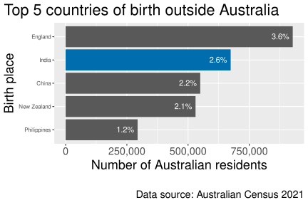
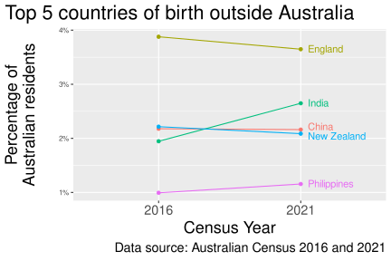
India became the third most common country of birth in 2021


  • Each label gives the percentage of 25,422,788 Australian residents born in that country.

  • Place of birth was not stated for 5.3% of Australian residents.

  • Australia is the most common country of birth: 66.9% of residents were born in Australia.

Story from The Guardian.

Another look

Data story

India has overtaken China and New Zealand to become the third largest country of birth for Australian residents, 2021 census data has found.

– The Guardian

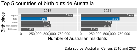
2016

Place of birth Count %
England 907,570 3.9
New Zealand 518,466 2.2
China 509,555 2.2
India 455,389 1.9
Philippines 232,386 1.0

2021

Place of birth Count %
England 927,490 3.6
India 673,352 2.6
China 549,618 2.2
New Zealand 530,492 2.1
Philippines 293,892 1.2

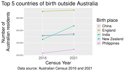
India overtook China and New Zealand by 2021

Does this show that India overtook China and New Zealand?

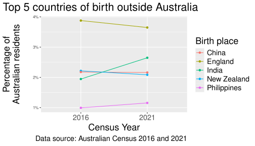
India overtook China and New Zealand by 2021

Should we show percentage instead of counts?

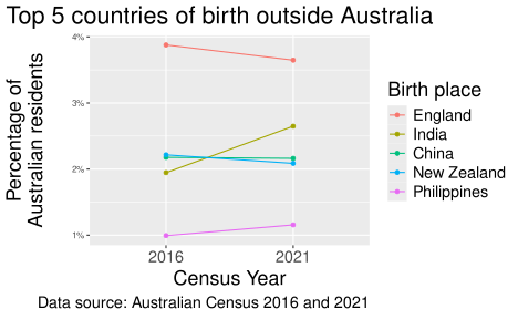
India overtook China and New Zealand by 2021

The legend and the line order are different…

India overtook China and New Zealand by 2021

Maybe we can put the labels directly in the plot?

India overtook China and New Zealand by 2021

Choosing a plot

🛒 What do you want to show?

Start with the question you want the visualisation to answer.

Compare values

For example, compare the five most common overseas countries of birth in 2021.

Show change over time

For example, show India overtaking China and New Zealand between 2016 and 2021.

🛒 What do you want to show?

Show a distribution

For example, examine how salaries vary within each academic rank.

Show a relationship

For example, examine the relationship between years since PhD and salary.

🤔 Revisiting the Census example

  • The data type, audience and medium also affect the choice of plot.

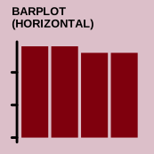
  • The ordered horizontal bar chart makes values and labels easy to compare.

  • The line chart emphasises change between the two Census years.
  • Direct labels remove the need to look back and forth between the lines and a legend.
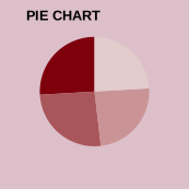
  • Pie charts would make these comparisons harder because they encode values as angles and areas.

Composite plots

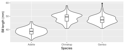
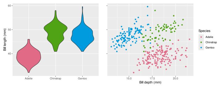
  • A plot can combine multiple geometries in one panel:

The violin shows the shape of each distribution, while the box plot shows its median and interquartile range.

Composite plots

  • A figure can also combine multiple plots:

The two plots answer different questions about the same outcome. Together, they show how salary varies by academic rank and years since PhD.

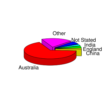
Why is a 3D pie chart a poor choice?

What about 2D pie charts?

Pie charts are a very bad way of displaying information. The eye is good at judging linear measures and bad at judging relative areas. A bar chart or dot chart is a preferable way of displaying this type of data.

  • This recommendation is supported by the empirical research of Cleveland and McGill (1984), among others.

Elementary perceptual tasks

Non-exhaustive

Retrieving information from graphs

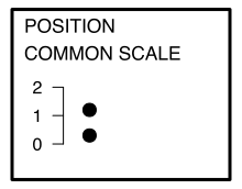
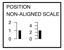
Cleveland and McGill (1984) tested how accurately people judge values from different encodings.

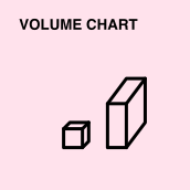
Position tended to be judged most accurately, colour and volume least accurately — but the exact ordering varies with the task, data size and design (see Heer and Bostock, 2010).

More accurate encodings

Examples

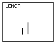
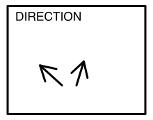
Position on a common scale and length/direction support more accurate value judgments in these experiments. Bar and scatter plots build on this.

Less accurate encodings

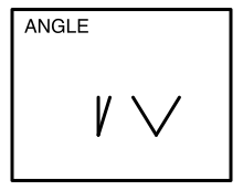
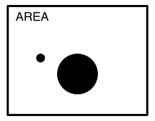
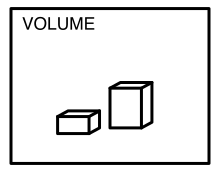
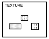
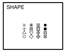
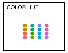
Angle, area, volume and colour are generally judged less accurately for extracting precise values. They remain useful for other purposes, such as using colour to group categories.

Examples of less accurate encodings

Examples

These encodings can reveal patterns, but they make precise comparisons harder than position or length on a common scale.

Preattentive processing

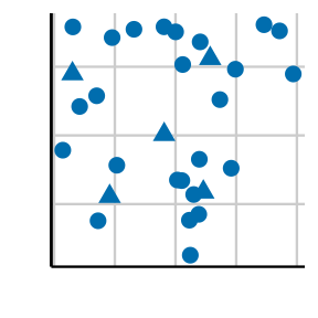
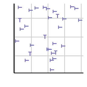
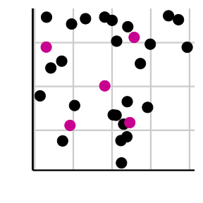
  • Viewers can notice that certain features are present or absent without focusing attention on a particular area.
  • Which plot makes the data points easiest to distinguish?

Gestalt principles

  • “Gestalt” is German for form or shape.
  • Gestalt principles describe how people perceive a collection of individual elements as a whole.

Law of proximity

  • Placing elements close together makes them easier to group and compare.

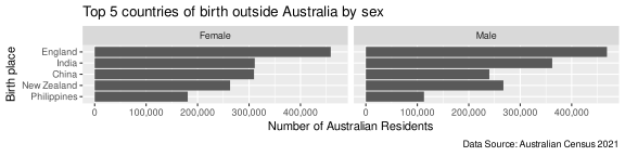
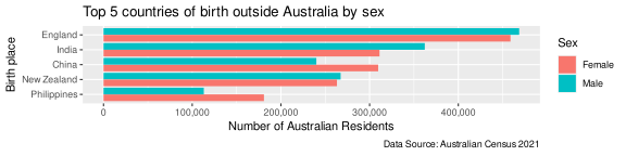
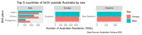
For which countries of birth are there more women than men among Australian residents?

Law of proximity

Data story

Among Australian residents born in the Philippines or China, women outnumber men. Among residents born in India, men outnumber women.

Law of similarity

  • When objects share similar attributes, they are perceived as being part of the same group.
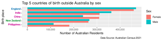
Notice that the countries are coloured by continent (Europe, Asia and Oceania).

Law of closure

  • Objects collected within a boundary-like structure are perceived as a group.
Colour space

Zeileis, Fisher, Hornik, Ihaka, McWhite, Murrell, Stauffer, Wilke (2019). colorspace: A Toolbox for Manipulating and Assessing Colors and Palettes. arXiv 1903.06490

Zeileis, Hornik, Murrell (2009). Escaping RGBland: Selecting Colors for Statistical Graphics. Computational Statistics & Data Analysis 53(9) 3259-3270

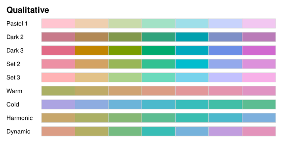
Qualitative palettes

  • Designed for categorical variables with no inherent ordering
colorspace::hcl_palettes("Qualitative", plot = TRUE, n = 7)
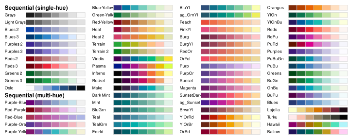
Sequential palettes

  • Designed for ordered categories or numeric values that move from low to high, or vice versa
colorspace::hcl_palettes("Sequential", plot = TRUE, n = 7)
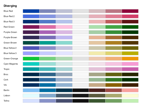
Diverging palettes

  • Designed for ordered categories or numeric values that diverge from a meaningful neutral value
colorspace::hcl_palettes("Diverging", plot = TRUE, n = 7)
Colour-vision deficiency

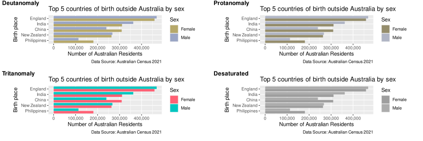
Colour-vision deficiency affects roughly one in eight men.

Check your colour choices with the colorblindr package or another colour-vision simulator.

Putting it all together

A practical design workflow

1. Diagnose

  • What is the message?
  • Who is the audience?
  • What comparison must they make?

2. Redesign

  • Choose an encoding
  • Create visual hierarchy
  • Remove distractions

3. Evaluate

  • Check honesty
  • Check accessibility
  • Test whether the message is clear

Diagnose the first draft

What makes this difficult to use?

. . .

  • The purpose is unclear
  • Labels are difficult to scan
  • The legend repeats the axis
  • Every country receives equal emphasis
  • The population, year and source are missing

Define the message and audience

Audience

A general reader who has not seen the Census table.

Message

India became the third most common country of birth among Australian residents in 2021, overtaking China and New Zealand.

The words became and overtaking mean that the visual must show change, not only the 2021 ranking.

Match the comparison to the encoding

Question Evidence needed Useful encoding
What ranked third in 2021? Values from 2021 Ordered bars
What changed between censuses? Values from 2016 and 2021 Lines or paired points
Did the share change? A common denominator Percentage of residents

Tip

The headline determines the comparison the chart must make possible.

Activity: redesign the first draft

Working with a partner:

  1. Write the message as one sentence.
  2. Identify the comparison the chart should support.
  3. Sketch a redesign.
  4. Justify two design choices using perception, Gestalt principles or accessibility.

Time: four minutes

Create hierarchy and remove distractions

  • Order supports comparison
  • Horizontal labels are easy to scan
  • Colour directs attention
  • Direct labels remove legend lookup
  • Title and source add context

Evaluate before publishing

Evidence

  • Does the title match the data shown?
  • Is the denominator clear?
  • Could the axis exaggerate a difference?
  • Are important groups or time points missing?

Communication

  • Is the intended comparison easy?
  • Is colour carrying meaning by itself?
  • Are labels legible at presentation size?
  • Can the source and time period be found?

The five-second test

Show the visual to someone unfamiliar with the analysis for five seconds, then hide it.

Ask them:

  1. What was the main message?
  2. What comparison did the chart ask you to make?
  3. What evidence do you remember?

If their answers differ from your intention, revise the visual—not the viewer.

Week 6 lesson

Summary

  • Start with the message, then choose a plot that makes the relevant comparison clear.
  • Position and length support more accurate comparisons than angles, areas and colour intensity.
  • Preattentive features and Gestalt principles help guide an audience’s attention.
  • Choose a palette suited to the data and check that it remains accessible to people with colour-vision deficiency.
  • Diagnose, redesign and test a visual before publishing it.

Week 6 resources