Rows: 53,940
Columns: 10
$ carat   <dbl> 0.23, 0.21, 0.23, 0.29, 0.31, 0.24, 0.24, 0.26, 0.22, 0.23, 0.…
$ cut     <ord> Ideal, Premium, Good, Premium, Good, Very Good, Very Good, Ver…
$ color   <ord> E, E, E, I, J, J, I, H, E, H, J, J, F, J, E, E, I, J, J, J, I,…
$ clarity <ord> SI2, SI1, VS1, VS2, SI2, VVS2, VVS1, SI1, VS2, VS1, SI1, VS1, …
$ depth   <dbl> 61.5, 59.8, 56.9, 62.4, 63.3, 62.8, 62.3, 61.9, 65.1, 59.4, 64…
$ table   <dbl> 55, 61, 65, 58, 58, 57, 57, 55, 61, 61, 55, 56, 61, 54, 62, 58…
$ price   <int> 326, 326, 327, 334, 335, 336, 336, 337, 337, 338, 339, 340, 34…
$ x       <dbl> 3.95, 3.89, 4.05, 4.20, 4.34, 3.94, 3.95, 4.07, 3.87, 4.00, 4.…
$ y       <dbl> 3.98, 3.84, 4.07, 4.23, 4.35, 3.96, 3.98, 4.11, 3.78, 4.05, 4.…
$ z <dbl> 2.43, 2.31, 2.31, 2.63, 2.75, 2.48, 2.47, 2.53, 2.49, 2.39, 2.…ETC5523: Communicating with Data
Tutorial 6
🎯 Objectives
- appreciate how certain choices in the construction of data visualisation reveals particular structures in the data
- given certain features in the data, create graphics that make the features more pronounced
- (re)create data plots using
ggplot2 - identify and apply cognitive concepts (e.g. preattentive processing, law of similarity, law of closure, law of proximity), elementary perceptual tasks (e.g. length, position, common scale, angle and so on) and color palettes that make the data plot effective for communicating the intended message
- critically evaluate whether the evidence shown in a data graphic supports the claim made about it
Preparation
- Install the R-packages
install.packages(c("ggridges", "ggbeeswarm"))💎️ Exercise 6A
Diamonds
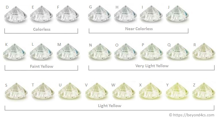
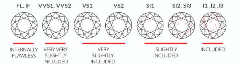
The dataset diamonds in the ggplot2 package includes attributes and price on 53,940 diamonds. Some of the attributes, such as carat, cut, color and clarity, are known to influence the price. Figure 1 and Figure 2 explain the order of classifications for color and clarity of diamonds. Use this data to answer the following questions.
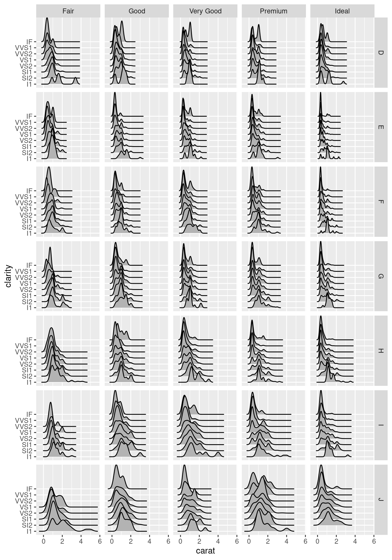
- Is there anything unusual about the distribution of diamond weights (i.e. carats)? Which plot do you think shows it best? How might you explain the pattern you find?
Solution
ggplot(diamonds, aes(carat)) +
  geom_histogram(binwidth = 0.01, aes(y = stat(density))) +
geom_density(color = "red") 
ggplot(diamonds, aes(carat))  +
  geom_boxplot() +
  theme(axis.text.y = element_blank(),
axis.ticks.y = element_blank()) 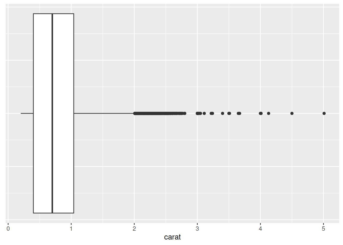
The distribution of the diamond weights has many frequency peaks followed by a dip in the frequency, most likely due to rounding to the higher number (i.e. applying some ceiling function). This is most noticeable from using a histogram with an appropriate bin width. Here the precision of the diamond weights are recorded in 0.01 units so using a bin width of 0.01 reveals this structure. Notice that the boxplot does not reveal this.
- What about the distribution of the prices? Can you find any unexpected feature? Which graphics best shows this unexpected feature?
Solution
g1 <- ggplot(diamonds, aes(price)) +
  geom_histogram(binwidth = 1) +
  scale_x_continuous(labels = scales::dollar) +
  labs(x = "Price", y = "Frequency")
g1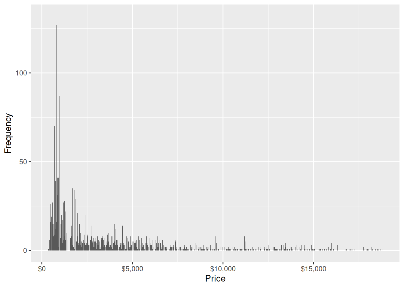
g1 + xlim(1400, 1600) 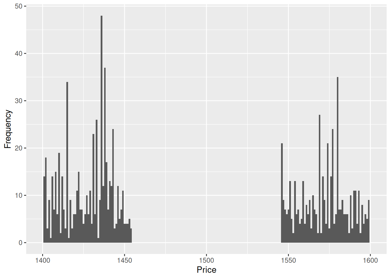
Plotting the histogram of prices with an appropriate binwidth reveals a noticeable gap between $1,455-1,545. Zooming into the histogram makes it easier to see this gap.
- Suppose that this data are a representative sample of diamonds around the world.
- The exploratory plot in first figure shows that there are hardly any diamonds with high carats that have high level of clarity. Produce a plot to support/contradict this claim.
- A diamonds whole seller wants to convince the jewellery store owner that $5,000 for a 2 carat diamond is a bargain price. Show a graphic that supports this story.
Solution
# this is done so the colors match up between the two plots
cols <- sequential_hcl(n = 8)
clarity_levels <- levels(diamonds$clarity)
g1 <- ggplot(diamonds, aes(carat, fill = clarity)) +
  geom_density() +
  scale_fill_manual(values = rev(cols), breaks = clarity_levels) +
  labs(x = "Carat", y = "Density")
g1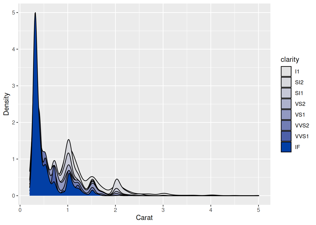
g1 + xlim(2.5, max(diamonds$carat)) +
  scale_fill_manual(values = rev(cols), breaks = clarity_levels)
We are only interested on the right tail so instead of focussing on the whole range, we can just focus on diamonds of 2.5 carats or more. By zooming in, the scale is adjusted and we can see what looked previously like a flat line has some peaks. We find that there are no clarity level higher than VS1 when carat is greater than 2.5. The color palette has been chosen so that it is sequential with a single hue. The clarity variable is an ordered categorical variable and this makes it easier to associate the darker shade of blue with higher clarity.”)
diamonds %>%
  filter(between(carat, 2, 2.05)) %>%
  ggplot(aes(x = "", y = price)) +
  ggbeeswarm::geom_quasirandom() +
  geom_hline(aes(yintercept=5000)) +
  scale_y_continuous(labels = scales::dollar, name = "Price") +
  theme(axis.text.x = element_blank(),
        axis.title.x = element_blank(),
        axis.ticks.length.x = grid::unit(0, "mm"))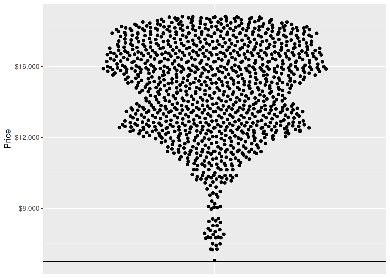
The plot shows that there is not a single diamond that is priced less than $5,000 if it is 2-2.05 carats. Bulk of the diamonds are more than double the price which should give confidence that even after taking into account marketing and other costs, there is a substantial profit margin.
🔧 Exercise 6B
Do insurance claims tell us who is most at risk? (25–30 minutes)
In 2024, AAMI published its Decade of Driving Report, based on more than 4.3 million motor insurance claims lodged from 2014 to 2023. The AAMI report page describes drivers aged 65 and over as its “most at-risk” age group because they accounted for 26% of claims. The finding was reported by ABC News under the headline:
Men and older drivers most at risk of car crashes, insurer finds
Your task is not to assume that the claim is right or wrong. Evaluate whether the published evidence supports the wording used.
The available evidence
The report ranks the age groups in this order:
- 65+ years
- 35–44 years
- 45–54 years
- 55–64 years
- 25–34 years
- 17–24 years
It reports a percentage only for the first group. The data come from motor claims across AAI Limited’s portfolio of insurance brands, rather than from a census of every Australian driver or crash.
# A tibble: 2 × 4
  age_group                     share_of_claims period     portfolio
  <chr>                                   <dbl> <chr>      <chr>
1 Drivers aged 65+                         0.26 2014--2023 AAI Limited motor in…
2 All other reported age groups            0.74 2014--2023 AAI Limited motor in…
B1. Diagnose the claim
Discuss the following questions with a partner and record your conclusions.
- What is the unit counted in the report: people, crashes, insurance claims, or something else?
- Does a group’s share of all claims measure an individual driver’s chance of making a claim? What denominator would be needed to estimate that risk?
- Does lodging a claim establish who caused a crash, how severe it was, or whether anyone was injured?
- Are the age groups directly comparable? In particular, compare the open-ended 65+ group with the narrower younger groups.
- To whom can findings from this portfolio of insurance brands reasonably be generalised?
- Write the strongest conclusion that the available evidence does support.
B2. Rewrite the message
Write a one-sentence headline that states the measure, population and period without describing claims share as risk. It should be understandable to a general news audience.
B3. Redesign the evidence
Use claims_share to create one simple, publication-ready graphic. Your graphic must:
- represent 26% as a share of this insurer portfolio’s claims;
- identify the 2014–2023 period;
- use direct labels rather than requiring a legend lookup;
- use colour and visual hierarchy deliberately, without relying on colour alone; and
- avoid implying that the data estimate crash risk for Australian drivers.
Below the graphic, justify two design choices using the visualisation concepts from the lecture. Then write a two- or three-sentence editor’s note explaining what additional data would be required to estimate risk. Consider comparable age bands, a denominator such as policyholder-years or distance driven, a clearly defined outcome, and information about fault.
Solution
B1. Evidence audit
The observation is an insurance claim, not necessarily one person or one crash. A crash may produce more than one claim, while some crashes produce no claim in this portfolio. The numerator therefore cannot, by itself, estimate an individual’s probability of crashing or claiming.
The evidence does not establish that drivers aged 65+ caused the incidents or that their incidents were more severe. The 65+ group is also open-ended, while most comparison groups cover only 10 years. A larger or more broadly defined group may account for more claims even if its members have a lower individual claim rate. Finally, the portfolio may differ from the wider driving population in its customers, products, locations and propensity to claim.
The strongest supported conclusion is:
Drivers aged 65+ accounted for 26% of motor claims in AAI Limited’s insurance portfolio between 2014 and 2023.
That is a useful descriptive result, but these data are insufficient to rank age groups by crash or claim risk.
B2. One defensible headline
Drivers aged 65+ accounted for 26% of AAI motor claims lodged between 2014 and 2023
This wording identifies the measure, source population and period. It does not extend the result to every Australian driver.
B3. One possible graphic
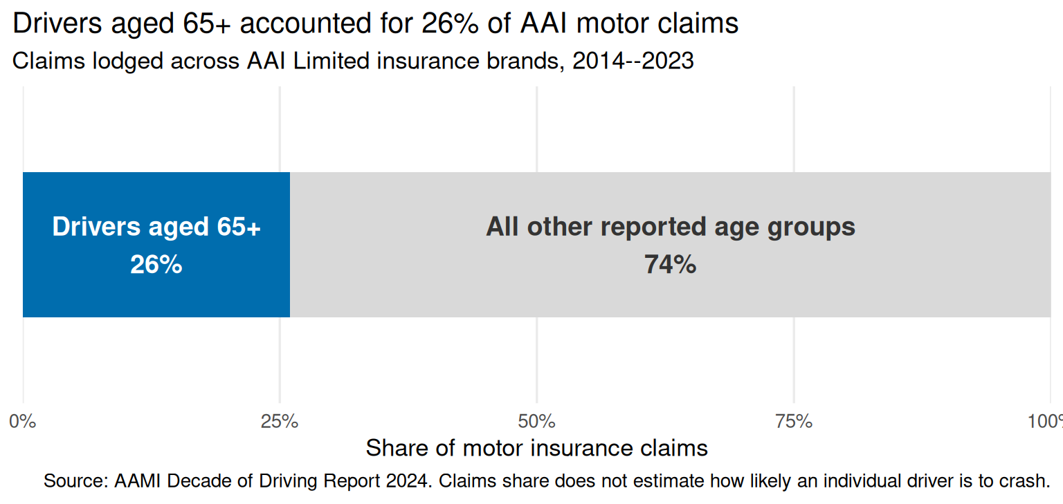
The shared scale and enclosing bar make the part-to-whole relationship explicit. The contrasting fill directs attention to the reported 65+ share, while the printed percentages ensure that colour is not carrying the meaning on its own. The title, subtitle and caption keep the visual claim within the scope of the evidence.
Editor’s note: To estimate age-specific risk, we would need claim counts and exposure denominators for comparable age groups within the same insurance portfolio. Policyholder-years would estimate the rate among insured customers; distance or time driven would better account for exposure on the road. We would also need to define the outcome and distinguish involvement from fault and severity.