ETC5523: Communicating with Data
CSS, AI-assisted coding, and polished ggplots
Lecturer: Michael Lydeamore
Department of Econometrics and Business Statistics
- michael.lydeamore@monash.edu
- Week 7
- cwd.numbat.space
Aim
By the end of today, you should be able to:
- apply small, scoped CSS changes to Quarto HTML output;
- brief an LLM to produce useful CSS or
ggplot2code; - inspect and verify generated code rather than accepting it on trust; and
- implement reusable techniques that turn a correct plot into a purposeful one.
The through-line
Visual intention → technical vocabulary → code → inspection → revision
An LLM can accelerate the middle of this process. It cannot decide whether the result communicates honestly and clearly.
Today extends Week 6
Week 6: design judgement
- What is the message?
- Which comparison matters?
- Where should attention go?
- Is the result honest and accessible?
Week 7: implementation
- How do I target the right element?
- How do I encode emphasis in code?
- How do I label without clutter?
- How do I get useful help from an LLM?
Part 1: CSS and AI-assisted coding
HTML is structure; CSS is appearance
<section class="finding">
  <h2>Reliable service matters most</h2>
  <p id="result">Reliability was selected by 46% of commuters.</p>
</section>
You only need three pieces of HTML vocabulary today:
| Kind | Example | CSS target |
|---|---|---|
| element | <h2> |
h2 |
| class | class="finding" |
.finding |
| identifier | id="result" |
#result |
A CSS rule answers two questions
What should change?
.finding is the selector.
How should it change?
Each property: value pair is a declaration.
Scope selectors to the smallest useful target
/* Every second-level heading */
h2 { color: #006DAE; }

/* Headings inside a finding */
.finding h2 { color: #006DAE; }

/* One unique result */
#result { font-weight: 700; }
Warning
*, div, p, and h2 can affect far more of a document than intended. Generated CSS often fails because its selector is too broad—or does not exist in the HTML at all.
The small set of properties you will use often
| Purpose | Properties |
|---|---|
| colour | color, background-color, border-color |
| type | font-family, font-size, font-weight, line-height |
| space | margin, padding, gap |
| edges | border, border-radius |
| alignment | text-align, display, align-items |
Start with the visual problem. Look up properties when you need them.
Use colour as a named design decision
CSS
The same visual vocabulary can travel across a webpage and its plots.
Put reusable CSS in a file
Use an inline CSS block for a quick experiment:
Move stable rules into styles.css so they can be reused and reviewed.
Inspect the page before changing the code
- Right-click the element and choose Inspect.
- Identify its element, classes, and surrounding container.
- Try a declaration in the browser’s Styles panel.
- Move the working rule into the source CSS.
- Render again and check more than one page or screen size.
Tip
Browser experiments are temporary. They help you discover the rule; the source file makes the change permanent.
“Make it look better” is not a technical brief
Under-specified
Make this callout look better with CSS.
. . .
Likely result: arbitrary colours, excessive decoration, and selectors that may not match the document.
Actionable
In this Quarto HTML page, style only elements with class
.finding. Add an 8 px blue left border and 1 rem of left padding. Do not change global headings or use!important. Return the smallest CSS rule and explain each declaration.
A useful LLM brief has four parts
Target
What should change?
Context
What code and output format matter?
Constraints
What must remain unchanged?
Check
How will you recognise success?
Request the smallest change, then ask what each selector, layer, or declaration does.
Generated code can look plausible and still be wrong
A six-step workflow for AI-assisted coding
- Supply the smallest relevant source and output context.
- State the visual intention.
- Specify constraints and an acceptance check.
- Request a minimal edit and an explanation.
- Render, inspect, and test the result.
- Describe the observed problem in the next prompt.
Important
Do not ask whether the code “should work”. Run it and collect evidence.
Live demonstration
Use the workflow to request one change:
On a Quarto RevealJS slide, style only
.key-resultblocks with a Monash blue left border, comfortable internal spacing, and no background fill. Preserve the existing theme and return only the CSS plus a two-sentence explanation.
One selector, one job
Only this block should change.
Then verify:
- the class exists;
- the rule is scoped;
- the properties are valid;
- the slide still works at 1280 × 720.
Part 2: A polished-plot cookbook
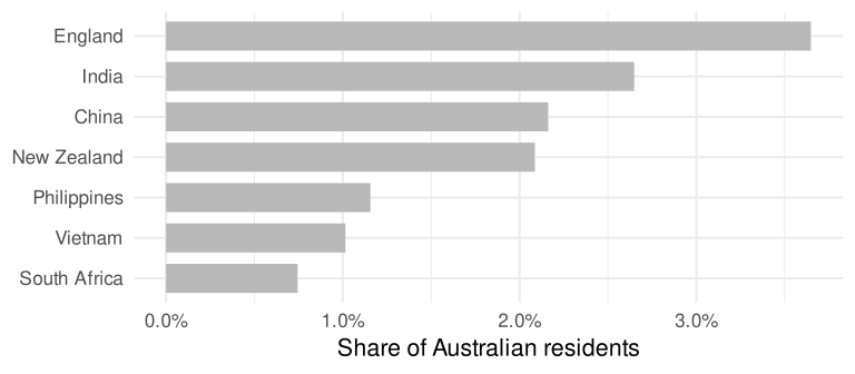
Recipe 1: highlight one bar without depending on order
One category carries the message, but every bar currently receives equal attention.
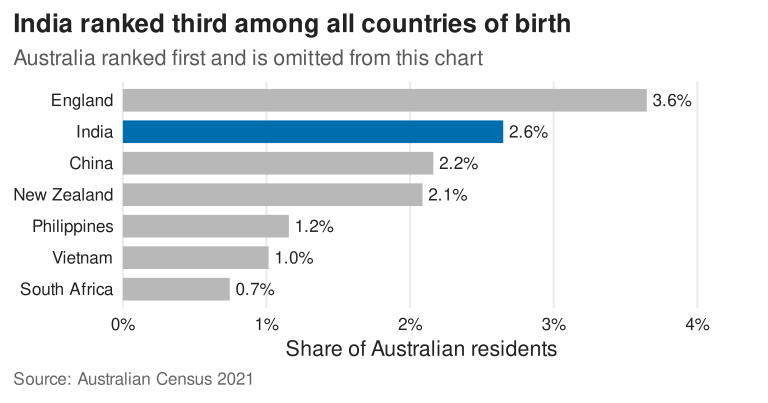
Recipe 1: create an explicit focus variable
plot_data <- plot_data |>
  mutate(focus = if_else(category == "India", "Focus", "Context"))

focus_colours <- c(
  "Context" = "#B8B8B8",
  "Focus" = "#006DAE"
)

ggplot(plot_data, aes(value, category, fill = focus)) +
  geom_col() +
  scale_fill_manual(values = focus_colours, guide = "none")
A named vector matches colours to meanings even if the rows or factor levels move.
India ranked third among all countries of birth
Recipe 1: prompt and pitfall
Adaptation prompt
Add an explicit
focusvariable that is"Focus"for India and"Context"otherwise. Map it tofilland use a named manual scale. Hide the legend. Do not rely on row or factor order.
Common generated mistake
Without names, colours are matched using the scale’s ordering. The code can silently emphasise the wrong category after a change in the data.
Recipe 2: draw context first, then emphasis
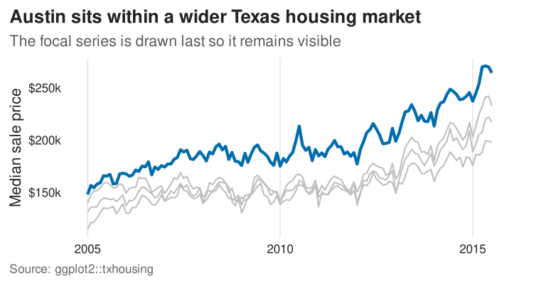
Problem
A manual scale changes colour, but the focal line can still be hidden underneath other lines.
ggplot(housing, aes(date, median, group = city)) +
  geom_line(colour = "grey75", linewidth = 0.7) +
  geom_line(
    data = filter(housing, city == "Austin"),
    colour = "#006DAE", linewidth = 1.4
  )
. . .
Layer order is drawing order: context first, focus second.
Austin sits within a wider Texas housing market
Recipe 2: prompt and pitfall
Adaptation prompt
Keep every city visible in light grey, then draw Austin again in blue with a thicker line. Use two
geom_line()layers so Austin is always on top. Do not remove the comparison cities.
Common generated mistake
Filtering the plot data removes the context. Emphasis is a relationship between foreground and background.
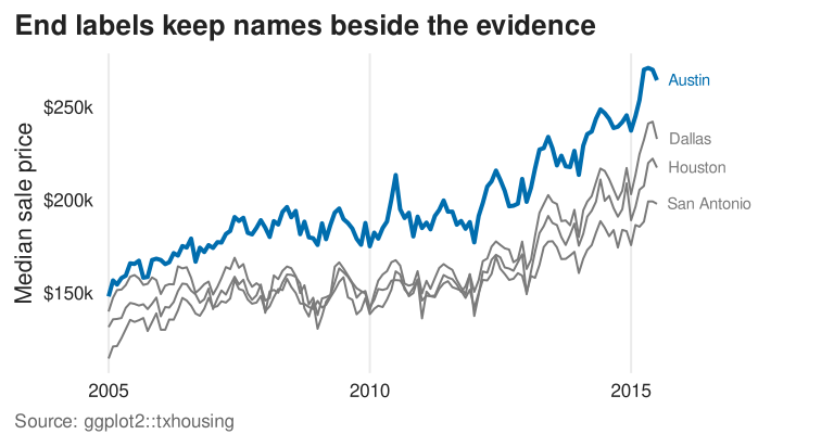
Recipe 3: replace legend lookup with end labels
endpoints <- housing |>
  group_by(city) |>
  slice_max(date, n = 1, with_ties = FALSE) |>
  ungroup()

ggrepel::geom_text_repel(
  data = endpoints,
  aes(label = city, colour = focus),
  direction = "y", hjust = 0, nudge_x = 90,
  segment.colour = NA, seed = 5523
)
Build a label dataset explicitly. Do not ask a text layer to label every observation.
End labels keep names beside the evidence
Recipe 3: prompt and pitfall
Adaptation prompt
Replace the legend with one label at the final date for each city. Construct an endpoint data frame, allow labels to move only vertically, add space on the right, and turn clipping off. Keep Austin blue and other labels grey.
Common generated mistake
This draws a label at every observation. Filter the label layer to one endpoint per group.
Recipe 4: annotate evidence, not decoration
reference <- mean(airport_year$mean_max)
highest <- slice_max(airport_year, mean_max, n = 1)

ggplot(airport_year, aes(year, mean_max)) +
  geom_hline(yintercept = reference) +
  geom_line() +
  geom_point(data = highest) +
  geom_label_repel(
    data = highest,
    aes(label = sprintf("%d: %.1f°C", year, mean_max))
  )
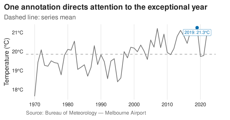
Use a reference line to establish context and a selective annotation to explain the exceptional observation.
One annotation directs attention to the exceptional year
Recipe 4: prompt and pitfall
Adaptation prompt
Add a dashed reference line at the series mean. Highlight and label only the year with the highest annual mean. Format the y-axis in degrees Celsius and state what the dashed line means in the subtitle.
Common generated mistake
Labelling every value converts the plot into a crowded table. Annotation should answer a particular question.
Recipe 5: make the finishing layer reusable
theme_cwd <- function(base_size = 16) {
  theme_minimal(base_size = base_size) +
    theme(
      plot.title.position = "plot",
      plot.caption.position = "plot",
      panel.grid.minor = element_blank(),
      panel.grid.major.y = element_blank(),
      plot.title = element_text(face = "bold"),
      plot.caption = element_text(hjust = 0),
      legend.position = "bottom",
      plot.margin = margin(10, 36, 10, 10)
    )
}
One function makes deliberate defaults easy to reuse and review.
Recipe 5: prompt and pitfall
Adaptation prompt
Extract the non-data styling from this plot into a function called
theme_cwd(base_size = 16). Start fromtheme_minimal(). Do not set data colours or axis scales inside the theme.
Common generated mistake
Changing the session-wide theme can alter unrelated plots. Add theme_cwd() to each plot unless a global change is intentional.
A polished plot still needs a review
Evidence
- Does the title match the data shown?
- Are the denominator and time period clear?
- Does emphasis hide relevant context?
- Are annotations computed from the data?
Communication
- Is the intended comparison easy?
- Is colour doing a specific job?
- Are labels legible at output size?
- Can the plot work without its legend?
Week 7 lesson
Summary
- CSS selectors scope a visual change; declarations describe the change.
- A good LLM brief names the target, context, constraints, and acceptance check.
- Generated code is a draft to render, inspect, and revise.
- Explicit focus variables, deliberate layer order, direct labels, and selective annotations create hierarchy in
ggplot2. - Reusable palettes and themes make consistency easier without replacing judgement.
Resources

ETC5523 Week 7