library(tidyverse)
library(here)
library(scales)

elo <- read_csv(
  here("data/pokemon-elo.csv"),
  show_col_types = FALSE,
  col_types = cols(date = col_date())
)

brand <- c(
  context = "#C7C7C7",
  champion = "#D93F00",
  leader = "#006DAE",
  ink = "#222222"
)

covid_start <- as.Date("2020-03-08")
covid_end <- as.Date("2022-03-12")

world_champions <- tribble(
  ~year, ~player_id,          ~player_name,
  2022,  "eduardo-cunha",    "Eduardo Cunha",
  2023,  "shohei-kimura",    "Shohei Kimura",
  2024,  "luca-ceribelli",   "Luca Ceribelli",
  2025,  "giovanni-cischke", "Giovanni Cischke",
  2026,  "takuma-yamazaki",  "Takuma Yamazaki"
)

generation_starts <- tribble(
  ~generation,          ~date,
  "Gen 7",              as.Date("2018-01-28"),
  "Gen 8",              as.Date("2020-01-11"),
  "Gen 9",              as.Date("2023-01-06"),
  "Pokémon Champions",  as.Date("2026-05-29")
)ETC5523: Communicating with Data
Workshop 7: Rescue a Pokémon Elo plot
The challenge
This workshop is one cumulative problem. You will turn a plot of Pokémon Video Game Championship Elo ratings from visual noise into an argument.
The Elo snapshot contains 51 players: frequently observed competitors, the 2022–2025 World Champions, and the current top three Elo leaders among players with at least 15 recorded events. The champion lookup also includes 2026 World Champion Takuma Yamazaki. Elo is an estimate from the available match archive, not an official ranking.
| Object | Important fields |
|---|---|
elo |
player_id, player_name, date, rating |
world_champions |
championship year and stable player_id |
generation_starts |
game-generation label and start date |
The stable ID is for selection and grouping; the display name is for readers. Match data were compiled by VGC History, and coverage varies across events.
Get the data
Download pokemon-elo.csv and save it as data/pokemon-elo.csv inside your course project. Then run this complete setup:
By the end, your plot should let a reader answer:
- Which recent World Champions have model histories, and how did they progress?
- Who leads the current Elo estimates, and how did they get there?
- Where did competitive play pause during COVID-19?
- When did the competitive game generations change?
Try to implement each change yourself. You may use an LLM to help with any task, but you remain responsible for checking what its code selects, changes, and displays.
1. Diagnose the plot before changing it (5 minutes)
ggplot(elo, aes(date, rating, colour = player_name)) +
  geom_line(linewidth = 0.7) +
  geom_point(size = 0.9) +
  scale_colour_discrete() +
  labs(
    title = "Pokémon Elo",
    x = "Date", y = "Rating", colour = "Player"
  ) +
  guides(colour = guide_legend(ncol = 2)) +
  theme_bw(base_size = 12)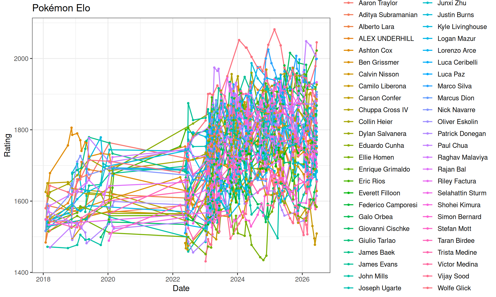
Do not begin with code. Write down:
- three things that compete for attention;
- two questions the plot cannot answer quickly; and
- one feature worth preserving.
Then write four acceptance criteria for the finished plot. Make each criterion observable.
2. Remove the empty COVID years (10 minutes)
There are no archived events between 8 March 2020 and 12 March 2022. Simply filtering those dates removes rows, but a continuous date scale still reserves two empty years.
Try to implement a ggplot2-only solution that:
- removes the empty interval from the visual scale;
- preserves real dates on both x-axes;
- uses separate before/after panels whose widths reflect their date ranges; and
- makes the discontinuity explicit.
A tempting but incomplete approach
elo |>
  filter(date < covid_start | date > covid_end) |>
  ggplot(aes(date, rating, group = player_id)) +
  geom_line()
The response removes observations but does not compress the continuous scale. The same empty horizontal interval remains.
Implement the change by creating a two-level era variable and using proportional free-x facets. Save the result as p_break.
Solution
elo_plot <- elo |>
  mutate(
    era = case_when(
      date <= covid_start ~ "Before COVID pause",
      date >= covid_end ~ "Competition resumes",
      TRUE ~ NA_character_
    ),
    era = factor(
      era,
      levels = c("Before COVID pause", "Competition resumes")
    )
  ) |>
  filter(!is.na(era))

p_break <- ggplot(
  elo_plot,
  aes(date, rating, group = player_id)
) +
  geom_line(colour = brand[["context"]], linewidth = 0.45) +
  facet_grid(
    cols = vars(era),
    scales = "free_x",
    space = "free_x"
  ) +
  labs(x = NULL, y = "Estimated Elo rating") +
  theme_minimal(base_size = 13) +
  theme(panel.spacing.x = unit(0.8, "lines"))

p_break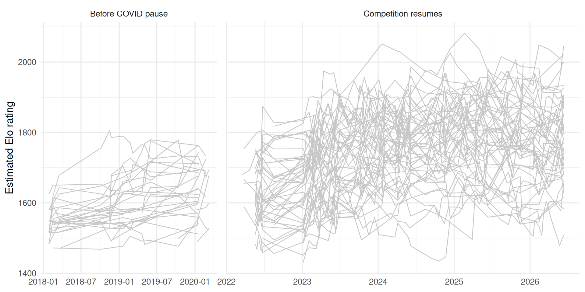
The facet gap is the scale break. The strips name what happened, so the missing interval cannot be mistaken for continuous time.
3. Add recent World Champions as focus lines (10 minutes)
Use world_champions to draw the five 2022–2026 champions above the grey context. First check that every champion exists in the Elo snapshot. Do not remove the other players and do not depend on row order.
Before changing the code, decide:
- whether all champions should share a colour;
- whether championship year belongs in a legend, a label, or neither; and
- how the line hierarchy will work if focus lines cross context lines.
A tempting but incomplete approach
elo_plot |>
  filter(player_id %in% world_champions$player_id) |>
  ggplot(aes(date, rating, colour = player_name)) +
  geom_line(linewidth = 1.2)
This makes the champions easy to see by deleting the competitive context. It also returns to one arbitrary colour per person.
Add a second line layer to p_break, using a named colour from brand. Save the result as p_champions.
Solution
champion_ratings <- elo_plot |>
  semi_join(world_champions, by = "player_id")

missing_champions <- world_champions |>
  anti_join(distinct(elo, player_id), by = "player_id")

missing_champions
# A tibble: 1 × 3
year player_id player_name
<dbl> <chr> <chr>
1 2026 takuma-yamazaki Takuma Yamazakip_champions <- p_break +
geom_line(
data = champion_ratings,
colour = brand[["champion"]],
linewidth = 1.05
)
p_champions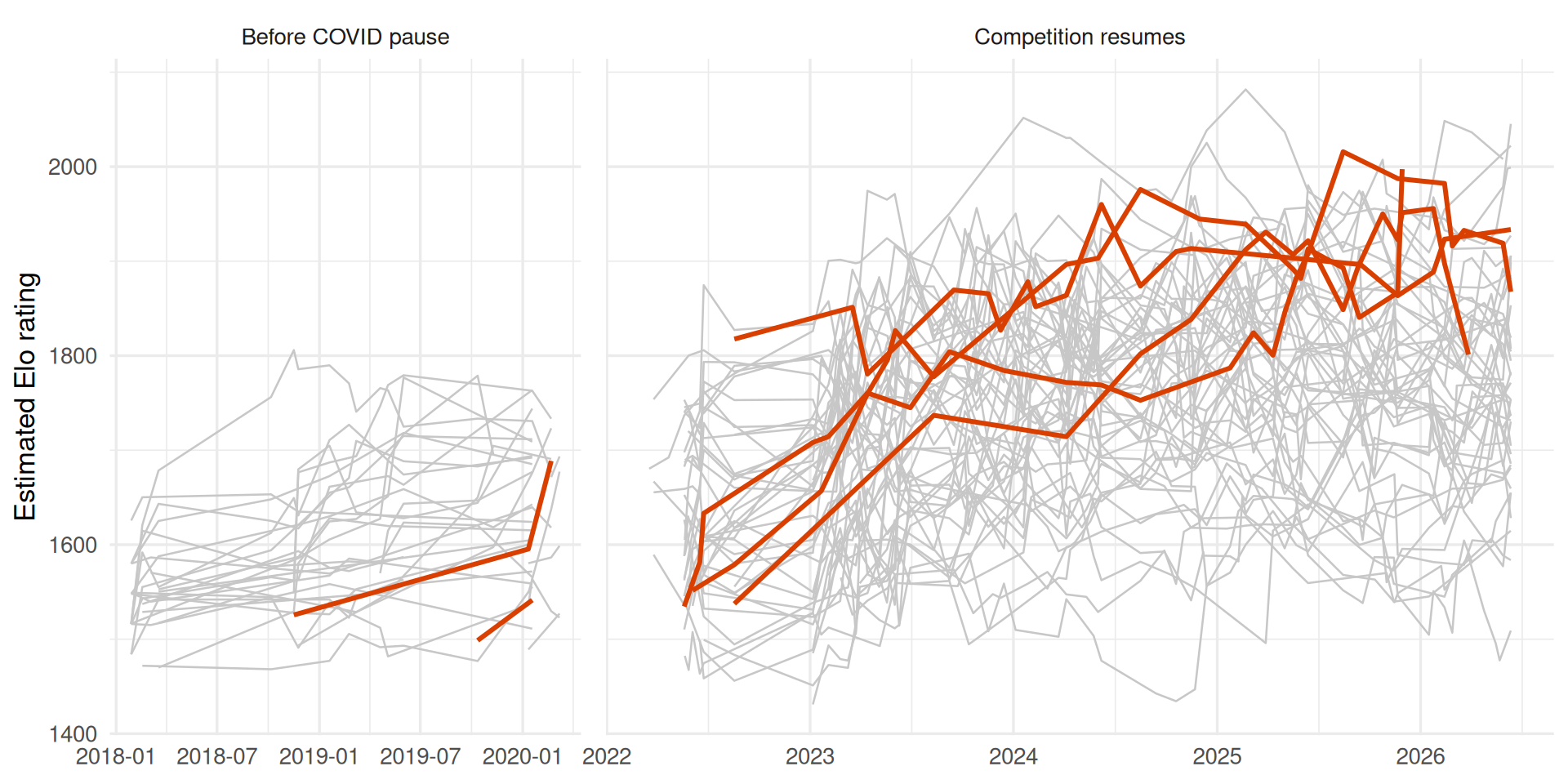
The focus layer comes last, so grey context lines cannot cover it. The join expresses the meaning of the selection and remains correct if the data order changes.
The coverage check identifies Takuma Yamazaki as missing: this model snapshot ends before the 2026 World Championships and contains no earlier matches under that identity. He belongs in the champion metadata, but drawing an Elo trajectory for him would require data that are not present.
4. Identify and trace the current leaders (10 minutes)
“Top three” must mean the three highest latest ratings—not the three highest rows ever recorded.
Create a one-row-per-player current table, select the top three, then draw their complete histories in Monash blue above both the context and champion layers. A player may qualify for more than one group; decide which status should control the visible style.
A tempting but incomplete approach
leaders <- elo_plot |>
  slice_max(rating, n = 3)
This selects rating observations, not current players. It may return several historical rows for one person and rewards an old peak rather than current standing.
Save the current table as current_ratings, the three IDs as leader_ids, and the updated plot as p_focus.
Solution
current_ratings <- elo |>
  group_by(player_id, player_name) |>
  mutate(events = n()) |>
  slice_max(date, n = 1, with_ties = FALSE) |>
  ungroup() |>
  filter(events >= 15)

leader_ids <- current_ratings |>
  slice_max(rating, n = 3, with_ties = FALSE) |>
  pull(player_id)

leader_ratings <- elo_plot |>
  filter(player_id %in% leader_ids)

p_focus <- p_champions +
  geom_line(
    data = leader_ratings,
    colour = brand[["leader"]],
    linewidth = 1.25
  )

p_focus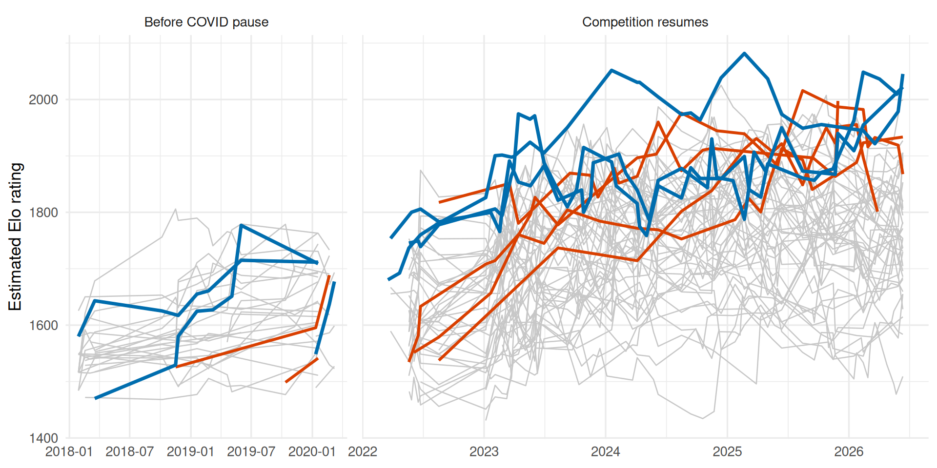
Here “current leader” wins any overlap because that layer is drawn last. The current leaders are Wolfe Glick, Eric Rios, and Paul Chua in this model snapshot.
5. Mark the game generations (8 minutes)
Add subtle vertical reference lines for the starts supplied in generation_starts. Because the plot is faceted, each boundary also needs the correct era value.
A tempting but incomplete approach
geom_vline(xintercept = c(2018, 2020, 2023, 2026))The x-scale contains Date values, not calendar-year numbers. The lines also lack labels and do not know which facet contains each date.
Create generation_plot, add dashed reference lines, and label each boundary once near the bottom of its panel. Save the plot as p_generations.
Solution
generation_plot <- generation_starts |>
  mutate(
    era = if_else(
      date <= covid_start,
      "Before COVID pause",
      "Competition resumes"
    ),
    era = factor(
      era,
      levels = levels(elo_plot$era)
    )
  )

p_generations <- p_focus +
  geom_vline(
    data = generation_plot,
    aes(xintercept = date),
    colour = "grey45",
    linetype = "22",
    linewidth = 0.45
  ) +
  geom_text(
    data = generation_plot,
    aes(x = date, y = -Inf, label = generation),
    colour = "grey35",
    angle = 90,
    hjust = -0.08,
    vjust = 1.25,
    size = 3,
    inherit.aes = FALSE
  )

p_generations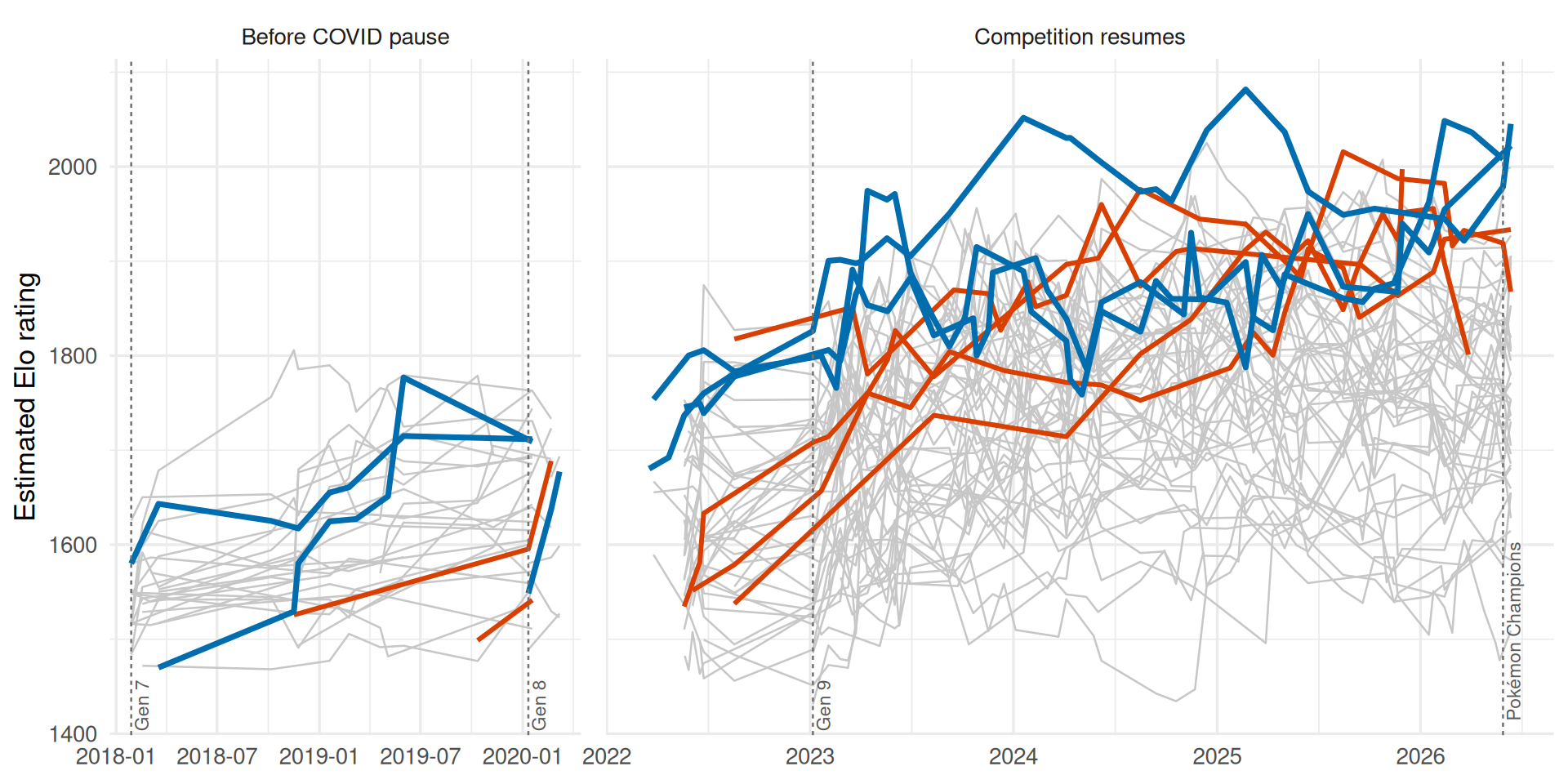
Using a data frame for reference marks is safer than four separate geom_vline() calls and makes the facet assignment inspectable.
6. Label the people, then finish the theme (12 minutes)
Replace lookup with direct labels. Label each focus player with an available history once, include the championship year for champions, and place the labels in a dedicated right-hand gutter without overlap. Then apply a finishing layer that supports the story rather than erasing useful guides.
Your finished plot must have:
- no player legend;
- distinct champion and leader colours that are also explained in text;
- space to the right for labels and no clipping;
- readable year and Elo axes;
- restrained gridlines, margins, title, subtitle, and source note; and
- no label at every observation.
A tempting but incomplete approach
p_generations +
  geom_text(aes(label = player_name)) +
  theme_void()
This adds thousands of labels and removes the axes needed to interpret time and Elo. “Minimal” is not the same as “remove every guide.”
Solution
focus_ids <- union(world_champions$player_id, leader_ids)

focus_endpoints <- elo_plot |>
  filter(player_id %in% focus_ids) |>
  group_by(player_id, player_name) |>
  slice_max(date, n = 1, with_ties = FALSE) |>
  ungroup() |>
  left_join(
    world_champions |> select(player_id, champion_year = year),
    by = "player_id"
  ) |>
  mutate(
    focus = if_else(
      player_id %in% leader_ids,
      "Current Elo leader",
      "Recent World Champion"
    ),
    label = if_else(
      is.na(champion_year),
      player_name,
      paste0(player_name, "\n", champion_year, " World Champion")
    )
  ) |>
  group_by(focus) |>
  arrange(rating, .by_group = TRUE) |>
  mutate(
    label_rank = row_number()
  ) |>
  ungroup() |>
  mutate(
    label_y = case_when(
      focus == "Recent World Champion" ~ 1760 + 65 * (label_rank - 1),
      focus == "Current Elo leader" ~ 1995 + 45 * (label_rank - 1)
    ),
    label_date = max(elo$date) + 120
  )

focus_colours <- c(
  "Recent World Champion" = brand[["champion"]],
  "Current Elo leader" = brand[["leader"]]
)

missing_champion_note <- world_champions |>
  anti_join(distinct(elo, player_id), by = "player_id") |>
  transmute(note = paste0(
    year, " World Champion ", player_name,
    " is not shown: no Elo history in this snapshot."
  )) |>
  pull(note) |>
  paste(collapse = " ")

p_final <- p_generations +
  geom_segment(
    data = focus_endpoints,
    aes(
      x = date, xend = label_date - 15,
      y = rating, yend = label_y,
      colour = focus
    ),
    linewidth = 0.35,
    alpha = 0.65,
    inherit.aes = FALSE,
    show.legend = FALSE
  ) +
  geom_text(
    data = focus_endpoints,
    aes(
      x = label_date, y = label_y,
      label = label, colour = focus
    ),
    hjust = 0,
    size = 3.2,
    lineheight = 0.9,
    inherit.aes = FALSE,
    show.legend = FALSE
  ) +
  scale_colour_manual(values = focus_colours) +
  scale_x_date(
    date_breaks = "1 year",
    date_labels = "%Y",
    expand = expansion(mult = c(0.02, 0.08))
  ) +
  scale_y_continuous(
    breaks = breaks_width(200),
    expand = expansion(mult = c(0.05, 0.10))
  ) +
  coord_cartesian(clip = "off") +
  labs(
    title = "Recent champions chase a high-rating leading group",
    subtitle = paste0(
      "World Champions are orange; the current top three Elo estimates are blue. ",
      "The panel break removes the COVID competition pause."
    ),
    x = NULL,
    y = "Estimated Elo rating",
    caption = paste0(
      "Elo model based on available VGC Masters matches; not an official ranking. ",
      "Match data: VGC History.\n",
      missing_champion_note
    )
  ) +
  theme_minimal(base_size = 13) +
  theme(
    plot.title.position = "plot",
    plot.caption.position = "plot",
    plot.title = element_text(face = "bold", colour = brand[["ink"]]),
    plot.subtitle = element_text(colour = "grey30"),
    plot.caption = element_text(colour = "grey40", hjust = 0),
    panel.grid.minor = element_blank(),
    panel.grid.major.x = element_blank(),
    panel.spacing.x = unit(0.8, "lines"),
    strip.text = element_text(face = "bold", colour = "grey30"),
    axis.title.y = element_text(colour = brand[["ink"]]),
    axis.text = element_text(colour = brand[["ink"]]),
    plot.margin = margin(10, 175, 10, 10)
  )

p_final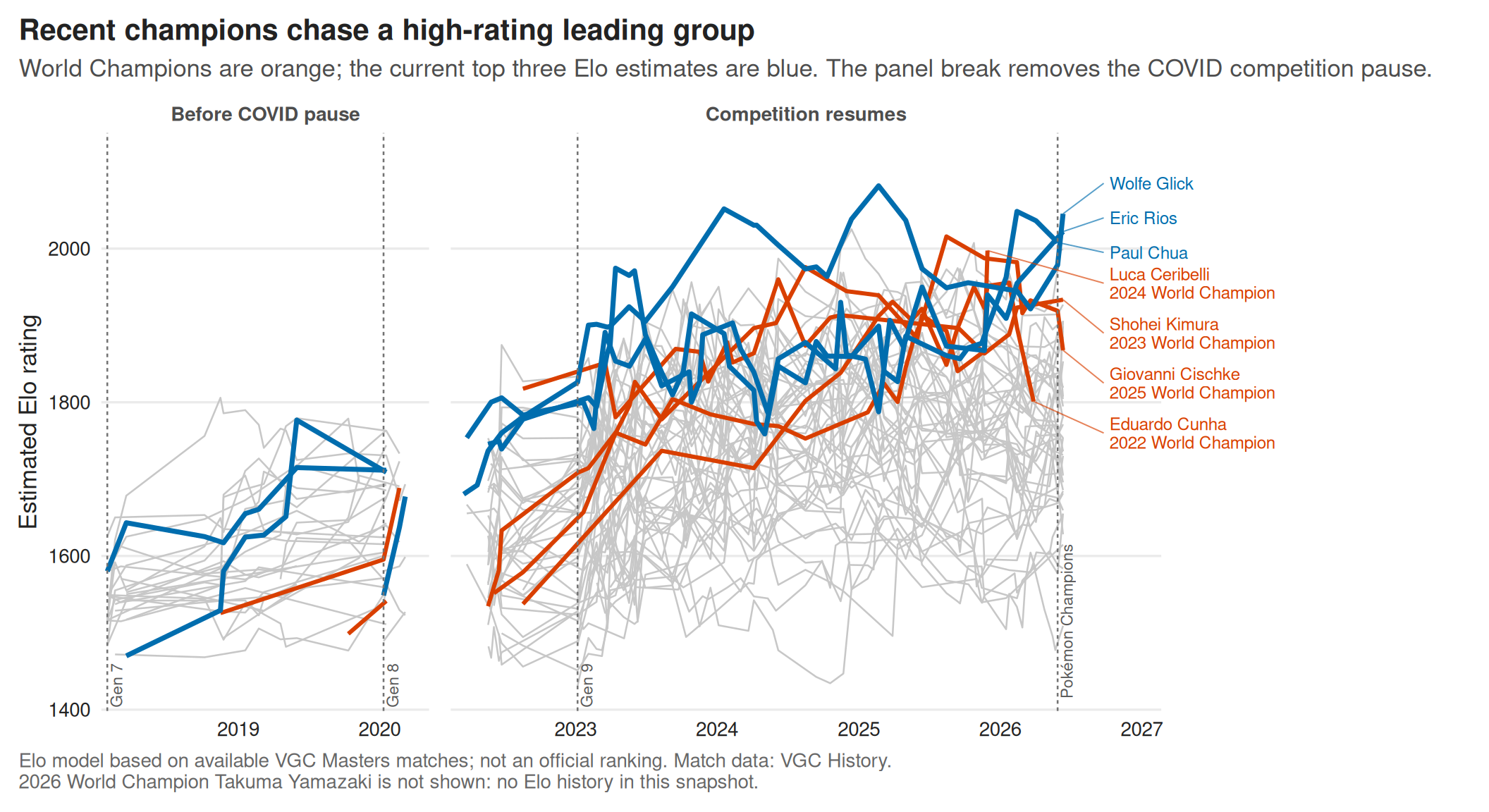
7. Red-team the result and submit (5 minutes)
Swap outputs with a partner. Try to break the claim or the code:
| Check | Question |
|---|---|
| Accuracy | Are “current leaders” based on one latest row per player? |
| Continuity | Is the COVID break unmistakable, rather than silently deleting time? |
| Hierarchy | Can you distinguish context, champions, and leaders immediately? |
| Labels | Is each focus player labelled once, without collisions or clipping? |
| Generations | Are boundaries attached to dates and placed in the correct facet? |
| Robustness | Would shuffled row order change any selected player or colour? |
| Honesty | Does the caption describe the model and data limitation? |
Submit:
- your final plot;
- the change that most improved it, and why;
- one attempted or suggested approach you rejected, and why; and
- one piece of visual or code evidence that your acceptance criteria pass.
Complete this sentence:
____________ helped me implement ____________, but I decided ____________ because ____________.