ETC5523: Communicating with Data
Structure, evidence and attention across formats
Lecturer: Michael Lydeamore
Department of Econometrics and Business Statistics
Aim
- Analyse what an audience knows, cares about, can do and needs next.
- Turn an analytical finding into a claim, evidence and implication.
- Compare how reports, journalism, presentations and dashboards organise attention.
- Design and briefly deliver a data story suited to its audience.
Why
- The same analysis may become a report, article, briefing, website or app.
- Those formats give the communicator and audience different amounts of control.
- The evidence must remain honest, but its selection, order and explanation must change.
One finding, many forms
Our running example
Finding
India is now the third most common country of birth among Australian residents.
Evidence
The 2021 Census ranks India behind Australia and England, and ahead of China and New Zealand.
Possible implication
Descriptions of Australia’s population that rely on older migration patterns may now misrepresent who lives here.
Note
The implication is plausible, but it still needs context and must not claim more than the evidence supports.
Evidence made visible
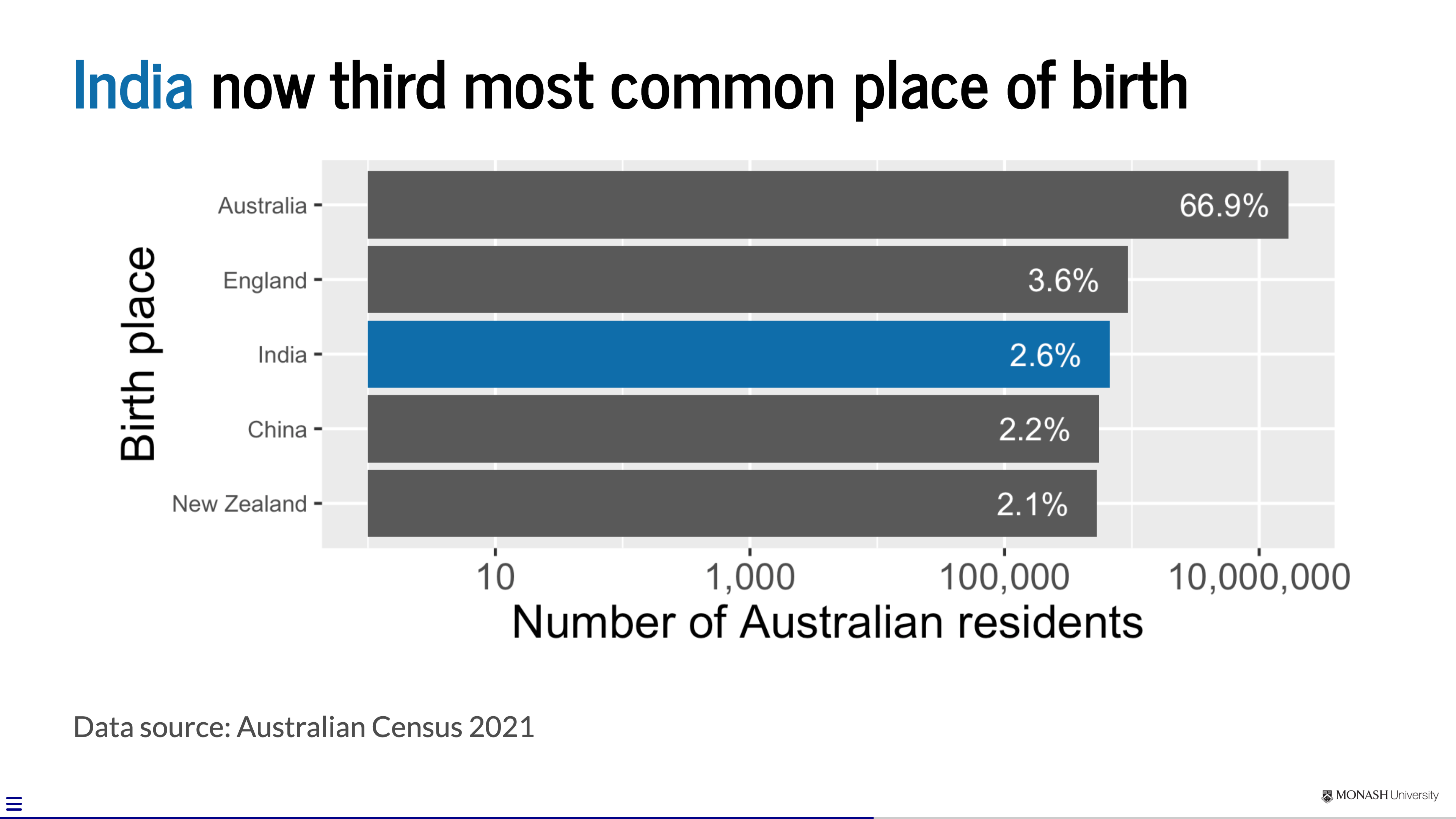
Analysis is not yet communication
Before choosing a format, decide:
- Audience: who needs this?
- Purpose: what should change?
- Claim: what should they understand?
- Evidence: why should they believe it?
- Implication: why does it matter?
Only then choose the form.
A practical audience brief
What do they know?
What context, terminology and uncertainty can be assumed?
What do they care about?
Which consequences connect the finding to their priorities?
What can they do?
Can they decide, investigate, share, question or explore?
What do they need next?
What detail or action makes the communication useful?
Same evidence, different jobs
| Form | Audience’s job | A useful opening |
|---|---|---|
| Technical report | evaluate and decide | conclusion and qualification |
| News story | understand why this matters now | headline and lead |
| Presentation | follow an argument in real time | orienting question or claim |
| Dashboard | investigate a relevant slice | guided overview and controls |
The “best” structure depends on how the audience will use the communication.
Structure follows use
Reports and articles
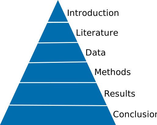
The reader can pause, scan, return and inspect detail.
Journalism
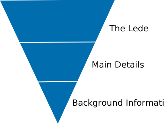
Lead with what is most important; later detail may never be read.
Presentations
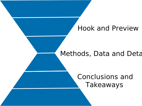
Orient the audience, develop the evidence, then land the conclusion.
Structures are expectations, not laws
- A familiar structure reduces the audience’s work.
- Purpose may justify departing from the default.
- Signpost unusual structures so the audience can still follow.
- Do not force the evidence into a dramatic arc it cannot support.
Who controls the path?
More author-led
- a recorded briefing
- a live presentation
- a news story
- an executive summary
The author selects the order and emphasis.
More audience-led
- a long technical report
- a website
- an interactive visualisation
- a dashboard
The audience chooses where to pause, branch or explore.
More control creates more opportunity—and more responsibility for guidance.
Build the message
Claim → evidence → implication
Claim
What should the audience understand?
India is now the third most common country of birth.
Evidence
Why should they believe it?
The Census ranks India behind Australia and England.
Implication
Why does it matter for this audience?
Older descriptions of the population may need revising.
The implication must be earned
- An implication connects evidence to a consequence, decision or next question.
- It is not permission to manufacture urgency or certainty.
- State important limitations and alternative explanations.
- Match the strength of the language to the strength of the evidence.
“So what?” and “How sure are we?” belong together.
Create ideas before files
Before opening PowerPoint, Quarto or any other tool:
- write the claim in one sentence;
- identify the evidence that earns it;
- decide the implication for this audience;
- sketch the order on paper; and
- remove material that does not serve that path.
Where data stories come from
Look for an evidence-supported:
- change over time;
- difference between groups;
- relationship between measures;
- exception to an expected pattern;
- consequence for people or decisions;
- uncertainty that changes interpretation.
Applying cognitive principles
Keep it simple
Cognitive Load Theory (John Sweller)
We can only absorb so much information at a time.
Embrace empty spaces in your slides!
Be audience-centred
- Don’t make your audience captives and waste their time away
- Gift your audience knowledge and/or joy
Learning Principles (Richard Mayer)
- Multimedia Principle: people learn better from words and pictures than words alone.
- Contiguity Principle: integrating text and visuals can lead to more learning.
- Coherence Principle: superfluous elements irrelevant to the teaching goal can disrupt and interfere with learning.
Designing the audience’s attention
Slides compete with the speaker
- Your audience cannot carefully read a slide and carefully listen to you at the same time.
- A slide should support the current idea, not store everything you know.
- Good design makes the intended order of attention obvious.
Four decisions for every slide
State the claim → show the evidence → explain the implication → direct attention
1 State the claim
Compare:
Topic label
Birthplace
Takeaway headline
India is now the third most common country of birth among Australian residents
A sentence headline tells the audience what to conclude. The rest of the slide must earn that conclusion.
2 Show the evidence
- Put the evidence on the same slide as the claim it supports.
- Prefer a visual, example or short quotation to a second explanation of the same idea.
- Label evidence directly where possible; do not make the audience hunt between a legend, footnote and graphic.
- Include enough source and context for the claim to be trusted.
Visuals are evidence—not decoration.
3 Explain the implication
The evidence does not speak for itself.
- Say what changed, who is affected or which decision is now different.
- Keep the implication close to the evidence that supports it.
- Distinguish an observed result from an interpretation or recommendation.
- Make uncertainty visible when it changes what the audience should conclude.
Do not make the audience perform the final inference alone.
4 Direct attention
Use a small number of signals:
- position
- size
- contrast
- spacing
- colour
- sequence
If everything is emphasised, nothing is emphasised.
Colour should explain the reading order
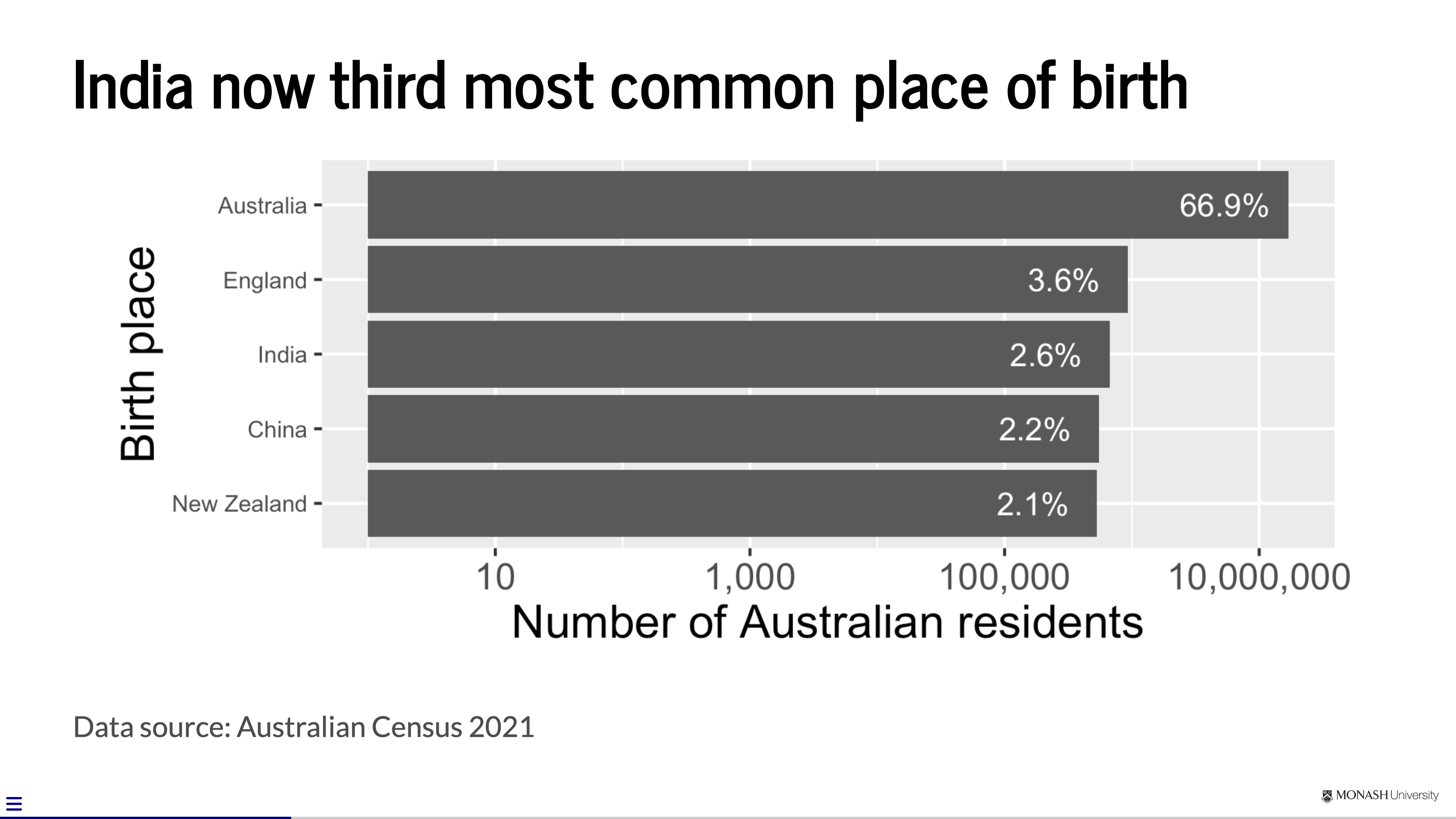
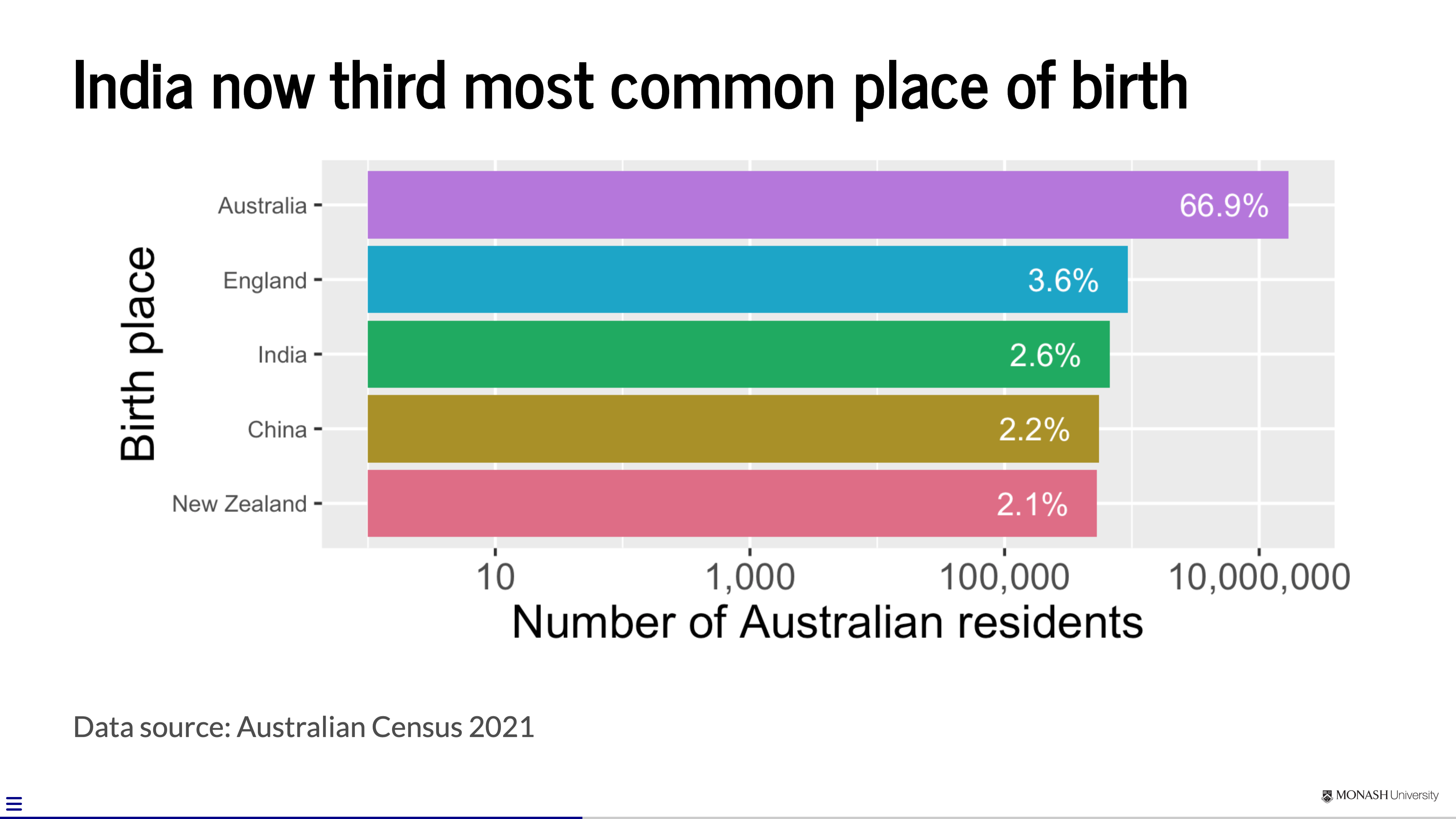
- Neutral colour lets the evidence establish a baseline.
- Many colours create competing categories.
- One contrast colour connects the headline to the evidence.
Type is infrastructure
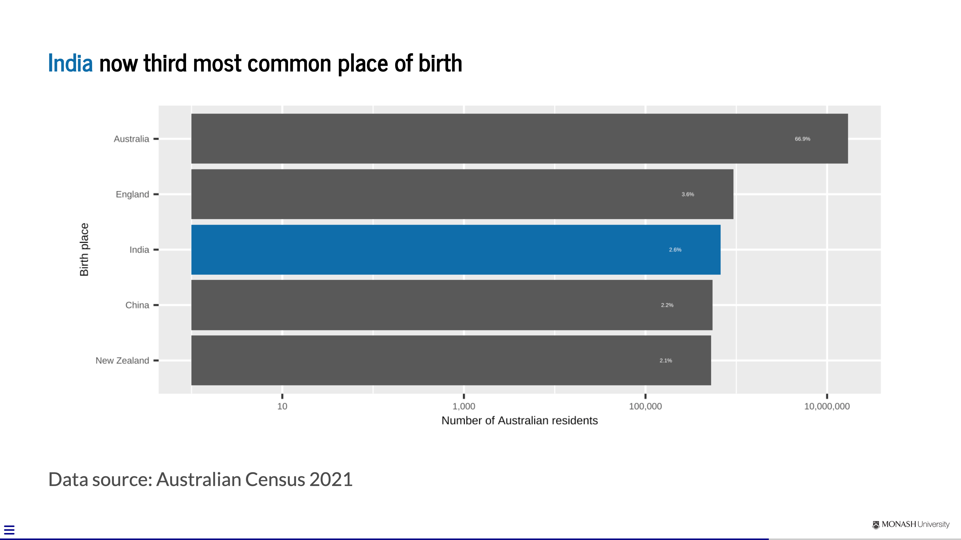
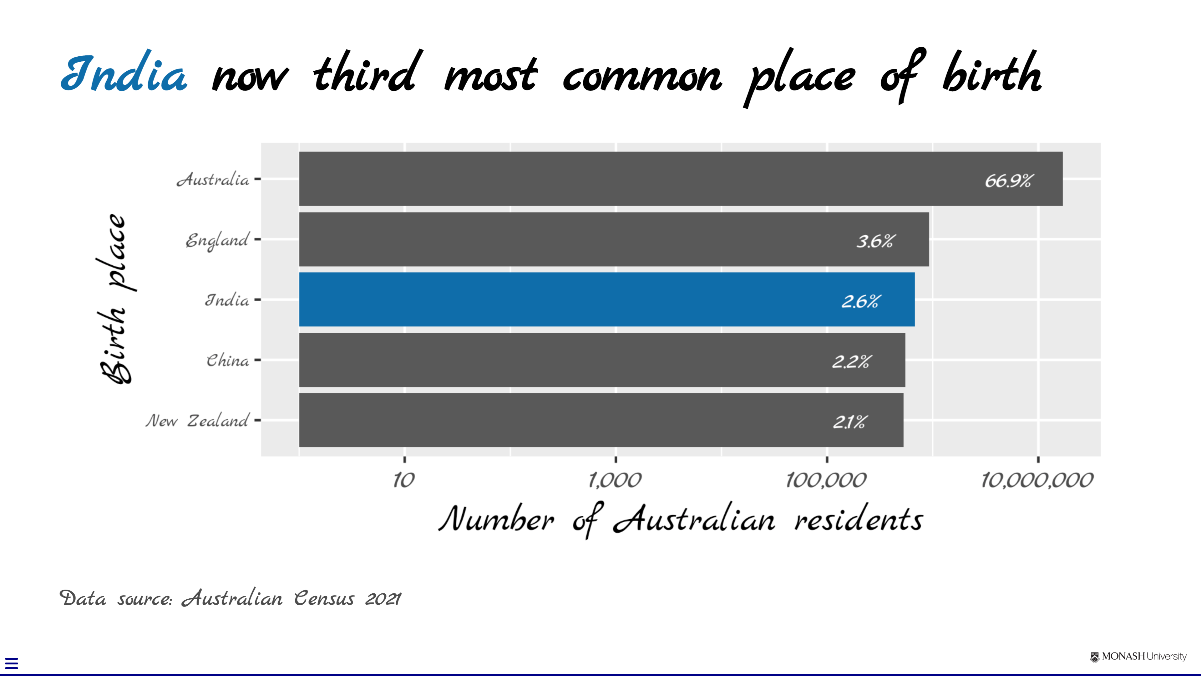
- Use type large enough to read from the back of the room.
- Create hierarchy with size and weight before adding another font.
- Choose legibility over personality for body text and labels.
A final test: remove competition
For every element, ask:
- Does it help the audience understand the point?
- Does it provide necessary evidence or context?
- Does it help them know where to look next?
If not, remove it. Empty space is working space for attention.
Match the treatment to the content
Text
- trim and group
- reveal in sequence
- avoid decorative icons
Data
- takeaway title
- direct labels
- selective emphasis
- honest scales and uncertainty
Images
- crop to the relevant detail
- use sufficient resolution
- explain why it is evidence
Across slides: create continuity
- Reuse layouts so the audience does not have to relearn the slide.
- Give repeated colours and visual forms a stable meaning.
- Use section breaks and signposts to show where the argument is going.
- Let the deck feel coherent, but vary the design when the content needs a different treatment.
Borrowing from journalism
A headline makes a promise
A useful headline or slide title is:
- specific: it states the subject and the change;
- concise: every word helps the audience predict the story;
- active: a strong verb shows what happened; and
- honest: the body can support the promise without qualification by surprise.
Topic: Birthplace
Claim: India is now the third most common birthplace among Australian residents
The lead pays off the promise
Headline
India is now the third most common birthplace among Australian residents
Lead
The 2021 Census ranks India behind only Australia and England as a country of birth, and ahead of China and New Zealand.
The headline gives the claim; the lead supplies evidence and context.
Concision is selection
Compare:
Before
The 2021 Census data shows that there are a number of changes that can be observed in relation to the countries in which Australian residents were born.
After
India is now the third most common country of birth among Australian residents.
Week 4 develops the editing techniques. For now: lead with the claim.
From telling a story to enabling exploration
- Data enriches a story: selected evidence adds scale or context.
- Data reveals a story: analysis discovers a change, difference or exception.
- Data becomes the experience: an app lets the audience explore within designed constraints.
The author gives up control of the path, not responsibility for guidance.
Activity: one finding, three decisions
Crime Statistics Victoria data are available here.
In pairs:
- identify one defensible claim;
- name the evidence required to support it;
- write an implication for a chosen audience; and
- decide whether an article, slide or interactive display best serves that audience.
The three-second test
At first glance, can the audience tell:
- what this slide is about?
- where to look first?
- what the evidence is doing?
This is a diagnostic, not a literal time limit.
A slide only works in the conditions in which it is delivered.
From slide to briefing
Slides and speakers divide the work
The slide
- anchors the claim;
- makes evidence visible;
- directs attention; and
- preserves essential labels and sources.
The speaker
- supplies context;
- explains the evidence;
- qualifies the interpretation; and
- lands the implication and transition.
If you read the slide aloud, one of you is redundant.
A 60-second data story
10 seconds
Orient
What question or problem are we addressing?
35 seconds
Explain
What is the claim, and what evidence earns it?
15 seconds
Land
What is the implication for this audience?
Practice: make the audience do less work
Using the birthplace example:
- choose an audience;
- prepare a 60-second explanation without writing a script;
- point to the evidence rather than reading labels aloud;
- finish with an implication; and
- ask your partner to repeat the takeaway in one sentence.
Their response is feedback: revise what did not get through.
Deliver to a real audience
Accessibility is audience-centred design
- Use text large enough for the viewing conditions.
- Maintain strong contrast and never use colour as the only signal.
- Describe the relevant pattern instead of saying “as you can see”.
- Caption recorded speech and provide text alternatives where appropriate.
- Avoid motion, sound or interaction that does not serve the message.
Live or recorded: protect the message
Check the conditions
- display, aspect ratio and room size
- microphone, sound and lighting
- recording frame and screen legibility
- links, media, animation and live code
Check the fallback
- local copy of all assets
- PDF or static export
- required adaptor or second device
- captions or transcript
- a plan for explaining a failed demo
Rehearse the communication, not merely whether the file opens.
Week 2 Lesson
Summary
- Begin with what the audience knows, cares about, can do and needs next.
- Build the message as claim → evidence → implication before choosing a format.
- Reports, journalism, presentations and dashboards structure attention differently because the audience uses them differently.
- In a briefing, the slide makes evidence visible while the speaker supplies context, qualification and implication.
- Accessibility, rehearsal, feedback and fallbacks are part of communication—not technical extras.
Week 2 Lesson
Resources
Note: the books below are freely available online via Monash Library.
- Better Presentations: A Guide for Scholars, Researchers, and Wonks by Jonathan Schwabish
- The Craft of Scientific Presentations by Michael Alley
- slide:ology by Nancy Duarte*
Note: the book below is not available on Monash library.
- Presentation zen: simple ideas on presentation design and delivery by Garr Reynolds*
* These books are oriented toward corporate presentations, so assess their advice in the context of technical communication.
Appendix: tools and Quarto
Choose a tool that fits the job
- PowerPoint, Keynote, Canva or Google Slides: quick visual authoring and collaboration
- Beamer: equation-heavy, PDF-first workflows
- Reveal.js: browser-based slides with flexible layouts and interaction
- Quarto + Reveal.js: reproducible slides combining prose, code, data and output
Choose the least complicated tool that preserves the communication you need.
Reveal.js with Quarto
These slides are made with Reveal.js through Quarto.
- The source is Markdown with additional layout and presentation options.
- A first- or second-level heading starts a new slide.
- Code, output and figures can be generated from the same reproducible source.
- HTML output supports links, fragments, embedded media and interactive content.
A minimal Quarto slide
---
title: "My data story"
format: revealjs
---

## The claim goes in the title

The evidence and explanation go here.
See the Quarto Reveal.js documentation for layouts, themes and presentation options.
