Rows: 53,940
Columns: 10
$ carat   <dbl> 0.23, 0.21, 0.23, 0.29, 0.31, 0.24, 0.24, 0.26, 0.22, 0.23, 0.…
$ cut     <ord> Ideal, Premium, Good, Premium, Good, Very Good, Very Good, Ver…
$ color   <ord> E, E, E, I, J, J, I, H, E, H, J, J, F, J, E, E, I, J, J, J, I,…
$ clarity <ord> SI2, SI1, VS1, VS2, SI2, VVS2, VVS1, SI1, VS2, VS1, SI1, VS1, …
$ depth   <dbl> 61.5, 59.8, 56.9, 62.4, 63.3, 62.8, 62.3, 61.9, 65.1, 59.4, 64…
$ table   <dbl> 55, 61, 65, 58, 58, 57, 57, 55, 61, 61, 55, 56, 61, 54, 62, 58…
$ price   <int> 326, 326, 327, 334, 335, 336, 336, 337, 337, 338, 339, 340, 34…
$ x       <dbl> 3.95, 3.89, 4.05, 4.20, 4.34, 3.94, 3.95, 4.07, 3.87, 4.00, 4.…
$ y       <dbl> 3.98, 3.84, 4.07, 4.23, 4.35, 3.96, 3.98, 4.11, 3.78, 4.05, 4.…
$ z <dbl> 2.43, 2.31, 2.31, 2.63, 2.75, 2.48, 2.47, 2.53, 2.49, 2.39, 2.…ETC5523: Communicating with Data
Tutorial 6
🎯 Objectives
- appreciate how certain choices in the construction of data visualisation reveals particular structures in the data
- given certain features in the data, create graphics that make the features more pronounced
- (re)create data plots using
ggplot2 - identify and apply cognitive concepts (e.g. preattentive processing, law of similarity, law of closure, law of proximity), elementary perceptual tasks (e.g. length, position, common scale, angle and so on) and color palettes that make the data plot effective for communicating the intended message
Preparation
- Install the R-packages
install.packages(c("ggridges", "ggbeeswarm", "ggrepel"))- Download the birth place data from the 2016 and 2022 Australian Census from Moodle.
💎️ Exercise 6A
Diamonds
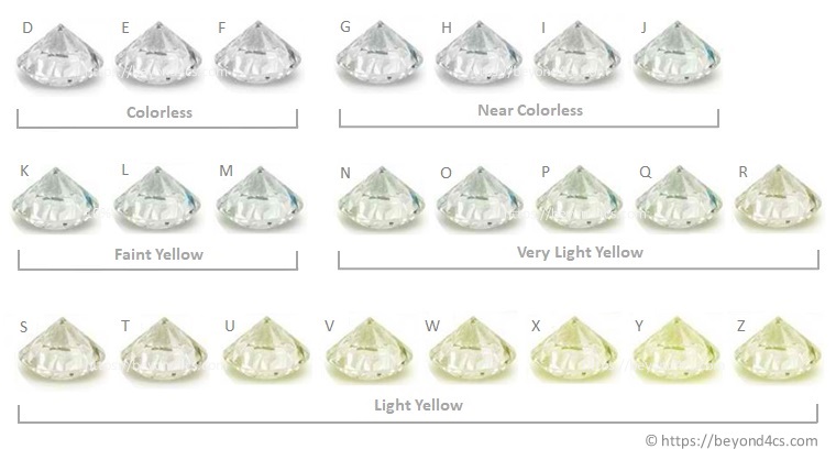
The dataset diamonds in the ggplot2 package includes attributes and price on 53,940 diamonds. Some of the attributes, such as carat, cut, color and clarity, are known to influence the price. Figure 1 and Figure 2 explain the order of classifications for color and clarity of diamonds. Use this data to answer the following questions.


- Is there anything unusual about the distribution of diamond weights (i.e. carats)? Which plot do you think shows it best? How might you explain the pattern you find?
- What about the distribution of the prices? Can you find any unexpected feature? Which graphics best shows this unexpected feature?
- Suppose that this data are a representative sample of diamonds around the world.
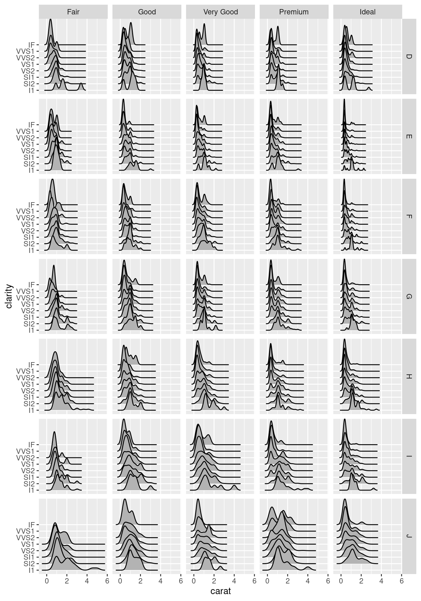
- The exploratory plot in first figure shows that there are hardly any diamonds with high carats that have high level of clarity. Produce a plot to support/contradict this claim.
- A diamonds whole seller wants to convince the jewellery store owner that $5,000 for a 2 carat diamond is a bargain price. Show a graphic that supports this story.
🔧 Exercise 6B
Birth place among Australian Residents
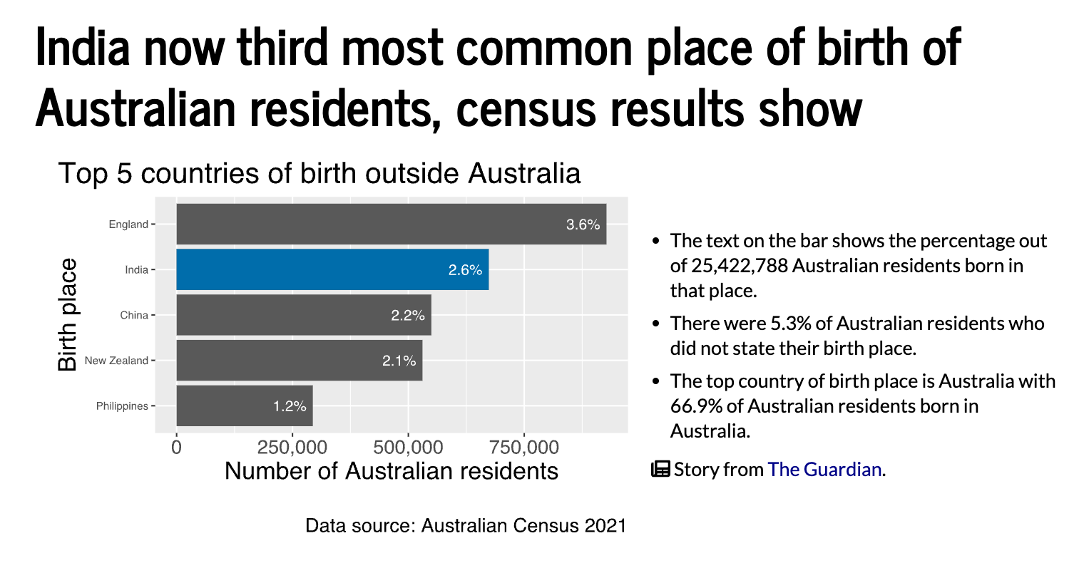
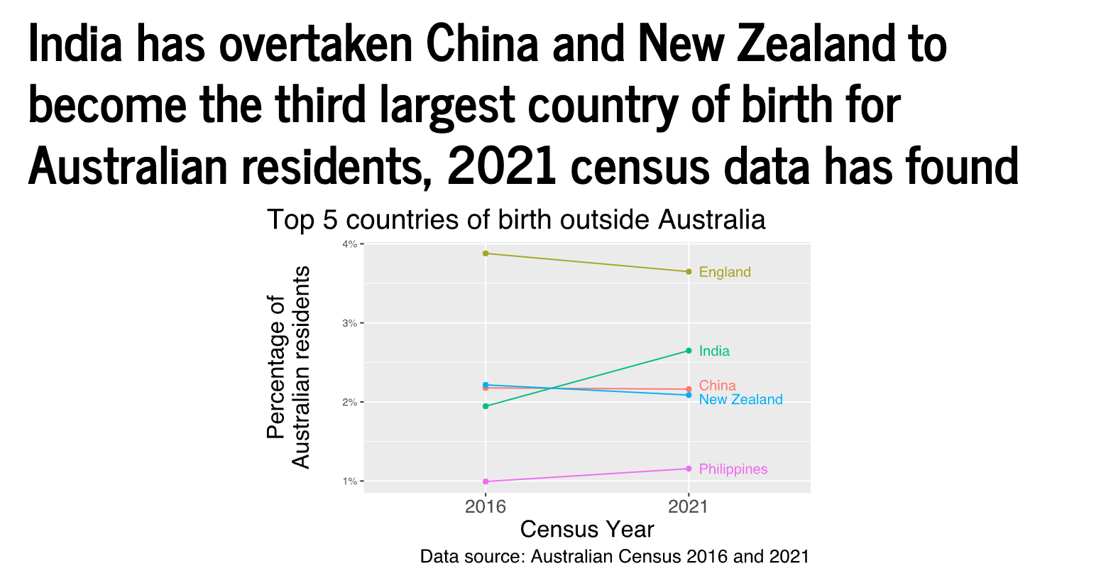
Recall the data stories from the lecture shown below. Using the data downloaded under Preparation, recreate the data plot shown below. Explain which concepts make the data plot more effective for the intended story.

