graph LR
A[Data Sources] --> B[Extract]
B --> C[Staging Area]
C --> D[Clean & Transform]
D --> E[Data Quality Checks]
%% Branch: some data skips transformation
C --> E
E --> F[Load]
F --> G[Data Warehouse]
%% Consumption paths
G --> H[Reports & Dashboards]
G --> I[Analytics & Modeling]
%% Feedback loop from analytics to transform
I --> D
ETC5523: Communicating with Data
Data storytelling on the web
Lecturer: Michael Lydeamore
Department of Econometrics and Business Statistics
- michael.lydeamore@monash.edu
- Week 3
- cwd.numbat.space
Learning objectives
Important
By the end of this lecture, you should be able to:
- specify what a standalone web page must tell a reader;
- write a headline and lede whose wording is supported by the evidence;
- select a visual that represents the comparison in the claim;
- distinguish essential context from methods detail and irrelevant material;
- build that structure as a reproducible Quarto website; and
- render, publish and check the result.
The course framework
Audience + purpose
Who is it for, and what should change?
Claim → evidence → implication
What, why believe it, and why does it matter?
Form + delivery
What helps people access and use it?
Feedback + revision
What got through, and what should change next?
Week 3 applies the framework to a web page
Last week
- audience and purpose
- claim, evidence and implication
- structure across different formats
- directing attention in presentations
This week
- structure for readers who control the path
- navigation and context
- reproducible web publishing
- feedback from a real reader
Next week: improve the sentences, transitions and summaries.
How web pages differ from presentations
The author controls less of the reading sequence
Presentation
The speaker controls:
- order;
- pace;
- emphasis; and
- when context appears.
Website
The reader can:
- arrive on any page;
- scan or skip;
- follow links;
- pause and return; and
- choose how much detail to inspect.
A standalone page must supply its own orientation
When a reader arrives directly on a page, they should be able to identify:
- the subject and main result;
- the population, measure and time period;
- the evidence supporting the result;
- the source and any material limitation; and
- the page’s place in the wider site.
These elements cannot depend on an oral introduction or a previous page.
Put the result and its basis in the first screen
First screen
- result-bearing headline
- lede with population, date and magnitude
- first visual or a clear route to it
- source visible with the evidence
Lower on the page
- fuller interpretation
- caveats
- detailed methods and definitions
- complete tables, code and references
Minimum specification for a short data story
| Element | Question it must answer |
|---|---|
| Population | Who or what is described? |
| Measure | What was counted or calculated, and in what units? |
| Time | When does the evidence apply? |
| Comparison | Relative to what group, place or earlier time? |
| Result | What changed, differed or ranked highest? |
| Source | Where did the data come from? |
| Qualification | What limitation could change the interpretation? |
Not every item belongs in the headline, but each must be available before it is needed.
Initial diagnosis: what is missing?
A reader lands directly on a page containing:
Australian birthplaces
The 2021 Census contains information about where Australians were born.[A chart with all countries in alphabetical order]
Identify:
- the result that has not been stated;
- the denominator and comparison that are ambiguous;
- the visual change needed to make the result inspectable; and
- any material that should move below the first screen.
Specify the claim before building the page
Running example: country of birth in the Australian Census
The data record the number and percentage of Australian usual residents by reported country of birth.
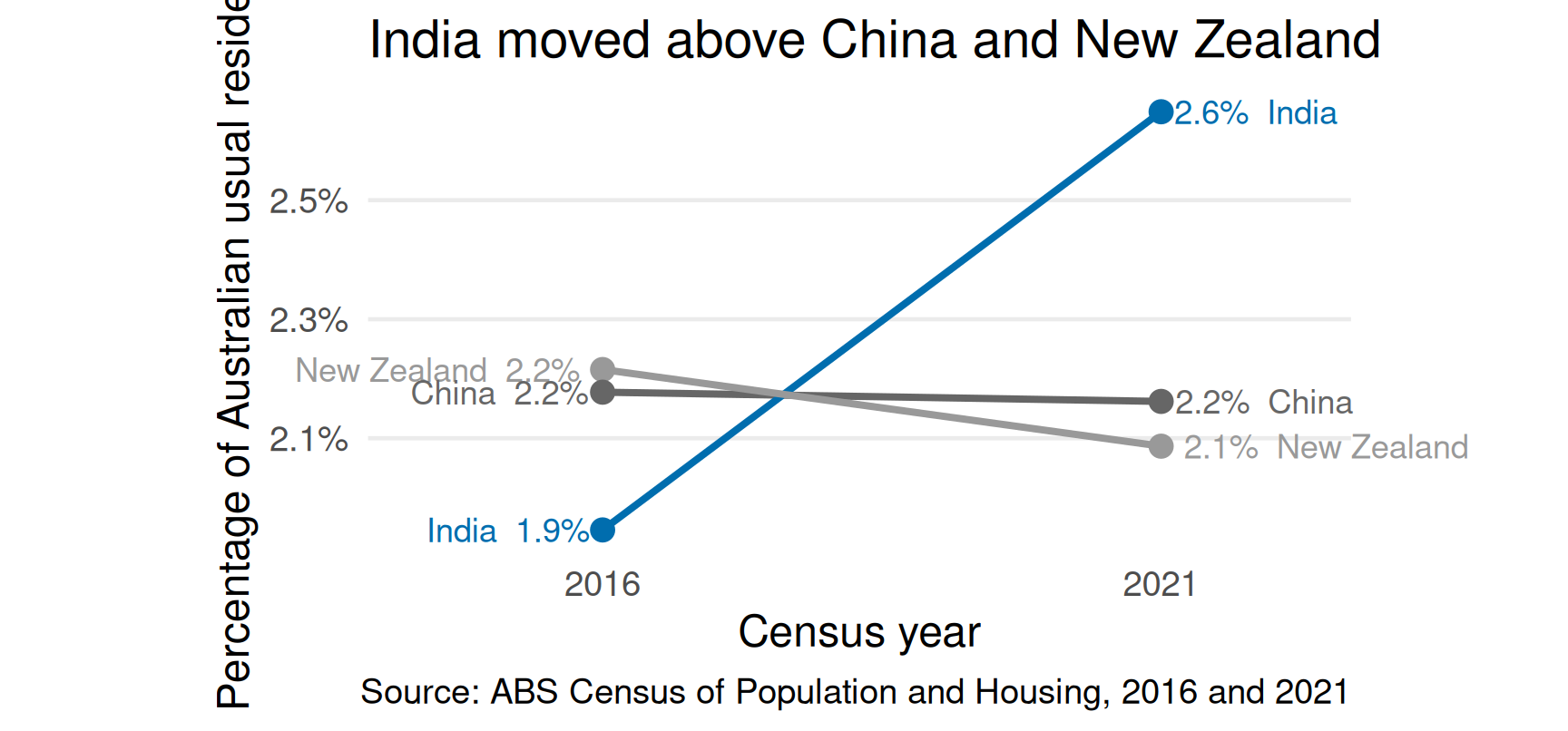
2016
- India: 455,389 (1.9%)
- China: 509,555 (2.2%)
- New Zealand: 518,466 (2.2%)
2021
- India: 673,352 (2.6%)
- China: 549,618 (2.2%)
- New Zealand: 530,492 (2.1%)
A 2021 ranking supports a statement about rank
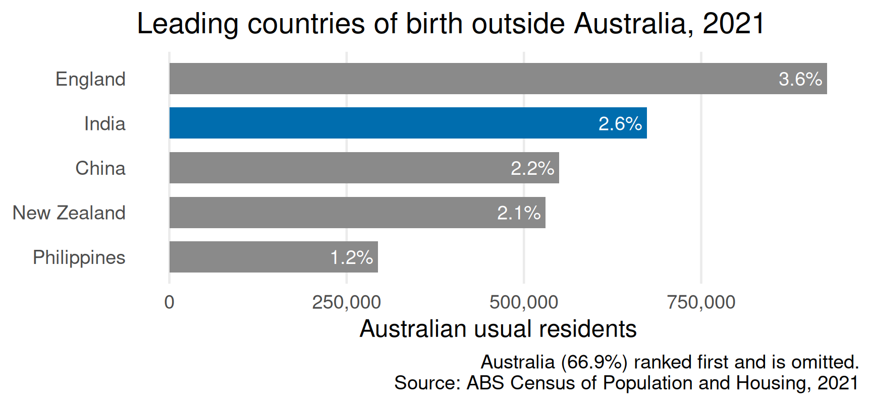
Supported: with Australia first and England second, India ranked third among reported countries of birth in 2021.
A one-year visual does not show that a rank changed
From the 2021 chart alone:
Supported
- India ranked third.
- India accounted for 2.6% of residents.
- India ranked ahead of China and New Zealand.
Not supported
- India became third.
- India overtook China and New Zealand.
- India’s share increased.
The second group requires a baseline or earlier observation.
Choose the verb from the available comparison
| Evidence available | Verbs normally supported | Verbs not yet supported |
|---|---|---|
| One cross-section | is, ranks, accounts for, differs from | rose, fell, became, overtook |
| Repeated observations | rose, fell, became, overtook | caused, led to |
| Observational association | is associated with, predicts | caused, produced |
| Credible causal design | caused, increased, reduced | universal claims beyond the study scope |
Check the subject, population, time and comparison as carefully as the verb.
The change claim requires both censuses
Headline wording must match the visual evidence
Topic label: no result
Country of birth in Australia
Unsupported if only the 2021 ranking is shown
India became the third most common country of birth among Australian residents
Supported when the 2016 and 2021 comparison is shown
India became the third most common country of birth among Australian residents in 2021
A headline should specify the result without carrying every detail
Check four components:
| Component | In the worked headline |
|---|---|
| Subject | India |
| Result | became third most common |
| Measure and population | country of birth among Australian residents |
| Time | in 2021 |
Avoid “now” when the publication date is unclear. Use the actual year.
The lede supplies evidence omitted from the headline
Important
Of Australian residents counted in the 2021 Census, 673,352 (2.6%) reported India as their country of birth, up from 455,389 (1.9%) in 2016. India therefore ranked behind Australia and England but ahead of China and New Zealand.
The lede identifies the population, dates, magnitude, baseline and comparison. It does not repeat the headline in different words.
Relevant qualification: 5.3% of residents did not state a country of birth in 2021; the ranking refers to reported categories.
Separate the claim, evidence and implication
Claim
India became the third most common reported country of birth in 2021.
Evidence
India rose from 1.9% in 2016 to 2.6% in 2021, moving above China and New Zealand.
Implication
Descriptions of Australia’s overseas-born population should not assume that the 2016 ordering still applies.
The implication is an interpretation. It should be proportionate to the evidence, not added merely to make the result sound important.
Select the visual from the comparison in the claim
| Claim concerns… | Suitable starting point | What the visual must expose |
|---|---|---|
| rank at one time | sorted bar or dot plot | order and magnitude |
| change over time | line or slope plot | common scale and temporal direction |
| difference between groups | dot plot, interval plot or grouped bars | comparable estimates and uncertainty when available |
| distribution | histogram, density, box or interval plot | spread, shape and unusual values |
| geographic pattern | map, often paired with a ranked plot | spatial relationship rather than location alone |
| exact lookup | table | values, units and definitions |
Colour and annotation direct attention; they cannot repair a visual that encodes the wrong comparison.
Context belongs in one of three locations
Main path
Needed to interpret the claim correctly.
- population and denominator
- measure and units
- time and comparison
- material limitation
- source
Methods or appendix
Needed to audit or reproduce the work.
- variable codes
- cleaning decisions
- complete tables
- software and code
- detailed definitions
Remove
Does not change interpretation or credibility.
- order the analysis was attempted
- software operations with no analytical consequence
- unrelated Census facts
- repetition
Apply a test before moving or deleting context
For each sentence, ask in order:
- Could removing it make the claim ambiguous or misleading?
Keep it on the main path. - Is it needed to audit, reproduce or investigate the result?
Put it in a source note, methods section, appendix or link. - Does it change interpretation, credibility or the reader’s next decision?
If not, remove it.
Worked context edit
Draft
The Australian Census is conducted every five years. We downloaded a CSV file, imported it with
readr, filtered it usingdplyr, and sorted all countries. India had 673,352 residents in 2021, compared with 455,389 in 2016.
. . .
Main story
In the 2021 Census, 673,352 Australian residents (2.6%) reported India as their country of birth, up from 455,389 (1.9%) in 2016.
. . .
Move to methods: data extraction, category definitions and cleaning decisions.
Remove: package operations and generic Census background unless they affect the claim.
Recommended order for this short story
- Headline: state the supported result.
- Lede: supply population, magnitude, date and baseline.
- Change visual: show the comparison required by “became”.
- Interpretation: explain the ordering and its relevance.
- Qualification: define country of birth and disclose material missingness.
- Source and methods: make the result auditable without delaying it.
Use headings to state section-level findings
Labels only
- Results
- Discussion
- Conclusion
These identify a document part but not its content.
Findings
- India’s share rose between the two censuses
- India moved above China and New Zealand
- The change affects how the ranking is described
These allow a reader to reconstruct the argument while scanning.
Activity data: Sunday library visits
| Month | Sunday visits |
|---|---|
| February | 790 |
| March | 1,250 |
| April | 1,540 |
| May | 1,840 |
Note
These fictional data cover three council library branches. Visits are measured using entrance counters; a person who leaves and returns may occasionally be counted twice. Sunday opening began in February.
Activity: test a headline, lede and visual
Using the library data:
- choose the comparison your story will make;
- sketch or describe the first visual;
- write a headline of at most 12 words; and
- write a lede of at most 35 words.
Exchange only the headline, lede and visual. Your partner records:
- the population, measure, time and comparison they infer;
- the exact words that the data and visual support;
- any causal or temporal overclaim; and
- whether the counter limitation must accompany the result.
Revise from the recorded interpretation. Do not explain what you intended.
Implement the structure in Quarto
Quarto keeps source, computation and output connected
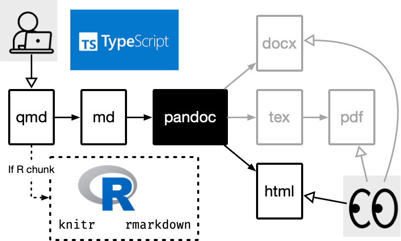
- write prose in Markdown;
- generate evidence from code;
- control behaviour with YAML;
- render a complete HTML site; and
- revise the source rather than hand-editing the output.
A webpage and a website solve different problems
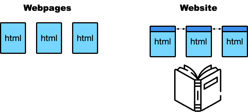
- A webpage is one document.
- A website connects pages through shared navigation, styling and structure.
- A visitor may encounter the pages in a different order from the one you imagined.
Separate site-wide, page and asset files
my-story/
├── _quarto.yml        # site-wide behaviour
├── index.qmd          # home page
├── about.qmd          # another page
├── styles.css         # visual customisation
└── posts/
    └── census-story/
        ├── index.qmd  # story source
        └── chart.png  # story asset
The project structure should help a future collaborator understand what belongs where.
_quarto.yml controls the whole site
A .qmd file specifies one page
Preview, render and publish are different checks
Inspect rendered output before publication
Before publishing, inspect the output—not only the source.
- Does the headline fit on the screen?
- Does the opening make sense without your explanation?
- Are figures, links and cross-references working?
- Can the page be used with keyboard navigation?
- Is essential context visible on a small screen?
- Does every page provide a route onward or back?
Use descriptive link text
Cross-references keep evidence connected to claims
```{r}
#| label: fig-birthplace
#| fig-cap: "India ranks third among countries of birth."
# chart code
```

India now ranks ahead of China and New Zealand
(@fig-birthplace).
A reference should explain why the reader needs the figure—not merely announce that it exists.
Test paths, navigation and screen width
- Render from a clean project.
- Check relative image and page links.
- Open more than the home page.
- Test at least one narrow screen.
- Ask another person to find the main claim.
- Check the public URL after publishing.
Render and publish the complete site
A published site connects four layers
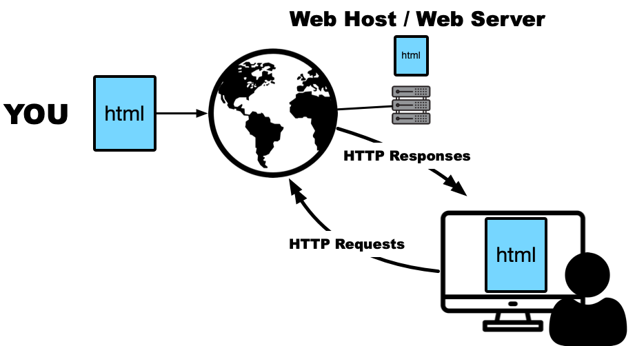
Rendering checks the build; publication and reader testing check delivery.
Assignment 3 uses GitHub Pages
Before publishing:
- Put the Quarto project in a Git repository.
- Sync the repository with GitHub.
- Render and inspect the complete site.
- Publish with the method specified for the assessment repository.
- Open the public URL and test it as a reader.
Connection to Assignment 3
Communication
- intended audience
- problem and main finding
- page structure
- figure and table integration
- conclusion or implication
Delivery
- Quarto website
- working navigation
- citations and cross-references
- version-controlled source and output
- public GitHub Pages URL
Workshop and tutorial tasks
Workshop
Shape the story:
- label structural roles;
- compare two possible orders;
- write a headline and lede; and
- test what a reader notices.
Tutorial
Build and deliver it:
- create the Quarto source;
- place it in a website;
- render the complete project; and
- publish and test the URL.
Pre-publication review
Who is the intended reader?
What exact claim does the evidence support?
Is the necessary context on the main path?
Can a reader verify the claim from the page?
Week 3 summary
Summary
- Web readers control more of the path, so authors must provide stronger orientation and navigation.
- Shape the claim, evidence, implication and story order before choosing a tool.
- Quarto connects source, computation and output in a reproducible website workflow.
- Previewing, rendering, publishing and reader-testing are different stages of delivery.
- The site succeeds when a real reader can understand and use the story.
Some cool Quarto stuff
webR
webR is a web server for R that allows you to run R code in the browser
webR with Quarto
- Community-developed extension to run R code in the browser
- Works with HTML, RevealJS presentations, websites, blogs
- Is how the startr.numbat.space website works
Setup
---
title: "Your slide title"
format: revealjs
engine: knitr
filters:
  - webr
webr:
  channel-type: "post-message"
---
And run:
An example slide:
An example slide:
Preload packages
You can specify packages to install in YAML:
and then use them as per normal:
Result:
Mermaid Diagrams
At some point you’ll almost certainly need to draw a flow diagram. Quarto can do this using Mermaid.
```{mermaid}
%%| echo: false
graph LR
    A[Data Sources] --> B[Extract]
    B --> C[Staging Area]
    C --> D[Clean & Transform]
    D --> E[Data Quality Checks]

    %% Branch: some data skips transformation
    C --> E

    E --> F[Load]
    F --> G[Data Warehouse]

    %% Consumption paths
    G --> H[Reports & Dashboards]
    G --> I[Analytics & Modeling]

    %% Feedback loop from analytics to transform
    I --> D
```
Mermaid diagrams
Maps
```{r}
library(leaflet)
library(dplyr)

# Create a data frame of locations
locations <- tibble::tribble(
  ~name,                           ~lat,       ~lng,
  "Melbourne CBD",                 -37.8136,  144.9631,
  "Monash University (Clayton)",   -37.8768,  145.0450,
  "University of Melbourne",       -37.7964,  144.9633
)

# Make the map
leaflet(locations) |>
  addTiles() |>
  addMarkers(
    lng = ~lng,
    lat = ~lat,
    popup = ~name
  )
```
Maps
Resources

ETC5523 Week 3